SwiftUI 拾遗
工程创建模板文件
创建工程时,Interface选择SwiftUI,Xcode 生成的工程模版会包含两个 Swift 文件:
// MyApp.swift

@main
struct MyApp: App {
    var body: some Scene {
        WindowGroup {
            ContentView()
        }
    }
}

// ContentView.swift

struct ContentView: View {
    var body: some View {
        VStack {
            Image(systemName: "globe")
                .imageScale(.large)
                .foregroundStyle(.tint)
            Text("Hello, world!")
        }
        .padding()
    }
}
- MyApp.swift中的
@main代表程序入口,一个进程只能有一个@main标注,- 能被标注为
@main的类型必须包含一个无参无返回值的静态 main 函数,即static func main()。
- 能被标注为
App代表应用程序,Scene代表应用程序的窗口,它们都是协议WindowGroup是其中一个Scene。
View代表视图,也是一个协议,每个View都有一个body属性,类型为some View,用于自定义View:
@available(iOS 13.0, macOS 10.15, tvOS 13.0, watchOS 6.0, *)
public protocol View {
    associatedtype Body : View
    @ViewBuilder @MainActor var body: Self.Body { get }
}
@MianActor作用是将body的获取派发到主线程。@ViewBuilder用于构建一个或多个视图, 原理是通过buildBlock方法传入多个View,然后返回一个TupleView:
@available(iOS 13.0, macOS 10.15, tvOS 13.0, watchOS 6.0, *)
@resultBuilder public struct ViewBuilder {
    // ...

    public static func buildBlock<each Content>(_ content: repeat each Content) -> TupleView<(repeat each Content)> where repeat each Content : View
}
因此:
struct ContentView: View {
    var body: some View {
        Image(systemName: "globe")
                .imageScale(.large)
                .foregroundStyle(.tint)
        Text("Hello, world!")
    }
}
以上代码也等效于:
struct ContentView: View {
    var body: some View {
        ViewBuilder.buildBlock(
            Image(systemName: "globe")
                .imageScale(.large),
            Text("Hello, world!")
        )
    }
}
@resultBuilder的作用可以简单理解为,省去buildBlock函数调用,直接在body里声明View。
Group
Group {
  if configuration.isPressed {
    Capsule()
      .fill(Color.element)
  } else {
    Capsule()
      .fill(Color.element)
      .northWestShadow()
  }
}
- Group is another SwiftUI container.
- It doesn't do any layout. It's just useful when you need to wrap code that's more complicated than a single view.
- 也就是组织代码用的, 放心使用
模拟器黑暗模式
- 在视图debug键的右方, 两个switch竖向排列的按钮, 即是
Environment Overrides, 打开Apperance开关 - 更多built-in EnvironmentValues, Many of these correspond to device user settings like accessibility, locale, calendar and color scheme.
View-level environment value
- 在视图容器上设置
.font(.headline), 则所有child view里的文字都会使用这个配置 - 在里层配置则会覆盖父级的配置, 实现个性化
GeometrReader
GeometryReader provides you with a GeometryProxy object that has a frame method and size and safeAreaInset properties.
GeometryReader { proxy in
    ZStack {
        ...
    }
}
同时预览多个设备:
Group {
  ContentView(guess: RGB()).previewDevice("iPhone 8")
  ContentView(guess: RGB())
}
ViewModifier
cs193里学到的是这样的, 要继承一个ViewModifier:
struct Cardify: ViewModifier {
    var isFaceUp: Bool

    func body(content: Content) -> some View {
        ZStack {
            Group {
                RoundedRectangle(cornerRadius: 10.0).fill(Color.white)
                RoundedRectangle(cornerRadius: 10.0).stroke(lineWidth: 3.0)
                content  // 正面卡片内容
            }.opacity(isFaceUp ? 1.0 : 0.0)
            RoundedRectangle(cornerRadius: 10.0)
            .opacity(isFaceUp ? 0.0 : 1.0) // 反面卡片内容
        }
    }
}
然后再扩展
extension View {
    func cardify(isFaceUp: Bool) -> some View {
        self.modifier(Cardify(isFaceUp: isFaceUp))
    }
}
- 其实是不必要的, 这么写只是让你能用
view.modifier(Cardify(isFaceUp: true))来使用 - 你期望的只是
view.cardify(isFaceUp: true)的话, 它只是一个普通的extension, 并不是说一定要modifier才能调用 - 用modifier只是为了语义上表示这是一个modifier, 与extension的用法没半毛钱关系, quick demo的话, 并不需要这么写
顺便了解下最完整的形态, 其实是一个ModifiedContent方法:
ModifiedContent(
  content: TextField("Type your name...", text: $name),
  modifier: BorderedViewModifier()
)
用style自定义控件
不管是button, 还是label, 都接受一个modifier来传入一个style, 这是一个继承ButtonStyle或LabelStyle的结构体
// button
struct NeuButtonStyle: ButtonStyle {
  let width: CGFloat
  let height: CGFloat

// 这个方法在写make开头时会自动感应出来, 不需要自己写
  func makeBody(configuration: Self.Configuration)
  -> some View {
    // button自带的几个子控件都在configuration里,
    // 取出来组合和自定义即可
    // 比如这里我们只取了label出来
    configuration.label
      .frame(width: width, height: height)
      .background(
        Capsule()
          .fill(Color.element)
          .northWestShadow()
      )
  }
}
// 使用
Button().buttonStyle(NeuButtonStyle(width: 327, height: 48))
- When you create a custom button style, you lose the default label color (变回黑色) and the default visual feedback when the user taps the button.
- 恢复颜色:
.foregroundColor(Color(UIColor.systemBlue)) - 添加动效:
.opacity(configuration.isPressed ? 0.2 : 1)
// Label
// SwiftUI的Label包含一个图标和一个文本(根据style不同可以只显示其中一个), 但是竖向排列很奇怪
// 这里演示把它手动用HStack包起来, 而不用默认的布局
func makeBody(configuration: Configuration) -> some View {
    // 同样, 用configuration取出来自定义即可
  HStack {
    configuration.icon
    configuration.title
  }
}

// 用法是一样的
Label().labelStyle(HorizontallyAlignedLabelStyle())
特殊情况, 下面这种情况不是用的makeBody而是_body方法, 最好找找出处:
// 1. 不是覆盖makeBody方法, 而是_body方法
// 2. 入参不再是configuration, 而是TextField自己(虽然形参还是叫这个)
// 3. 但_body没法自动感应出来, 教程也没说为啥要这样写, debug进别的原生style, 也是写makeBody方法的
// 3.1 更神奇的是, makeBody方法也感应不出来
// 4. 因此不是从configuration里面取控件, 而是直接对整个控件写modifier
public func _body(
  configuration: TextField<Self._Label>) -> some View {

  return configuration
    .padding(EdgeInsets(top: 8, leading: 16,
                        bottom: 8, trailing: 16))
    .background(Color.white)
    .overlay(
      RoundedRectangle(cornerRadius: 8)
        .stroke(lineWidth: 2)
        .foregroundColor(.blue)
    )
    .shadow(color: Color.gray.opacity(0.4),
            radius: 3, x: 1, y: 2)
}

// 使用
TextField("Type your name...", text: $name).textFieldStyle(KuchiTextStyle())
用ZStack还是background做背景图
- ZStack会根据子视图的大小而扩展, 如果你添加了一张大于屏幕的图片, 那么这个ZStack其实也大于屏幕了
- 会使得一些绘制属性为"fill"的元素也超出屏幕
- 如果你添加了其它会充满容器的控件(比如
TextField会横向填充) - background modifier则不会更改其修饰的对象的大小
- 这样如果你需要全屏的background, 你得保证修饰的视图本身是全屏的(至少能用padding填满)
Button
- SwiftUI中Button的定义:
struct Button<Label> where Label : View - 其中
Label是个泛型, 只需要是个View就行了
构造方法:
init(
  action: @escaping () -> Void,
  @ViewBuilder label: () -> Label
)
可见:
- action不是trailing closure, 跟
UIKit习惯相反, SwiftUI中最后一个closure通常是为了声明视图 Label修饰为@ViewBuilder, 意思是返回一些views(默认竖向排列)
- 关于要点1, 其实在SwiftUI中也有点妥协, 允许像trailing closuer一样直接用双括号语法, 也不要写参数名
- 但是这样的话第二个参数名就不能省了
观察下面的两种写法, 在SwiftUI中是等效的
Button {
    print("aa")
} label: {
    Text("bb")
}
Button(action: {
    print("aa")
}) {
    Text("bb")
}
child view chose it's own size
Views choose their own size; their parents cannot impose size but only propose instead.
Text("lone text").background(Color.red) // 生成一段文字, 底色是红色

Text("lone text").background(Color.red)
.frame(width: 150, height: 50, alignment: .center)
.background(Color.yellow)
- 生成一段文字, 并用150x50的视图框起来
- 记住, 任何modifier都是新view, 即便是frame, 不要以为这是在为老view设置frame属性, 没这种东西 2.1 所以, 现在视图层级成了 Text - Frame - Root
- 这段文字在150x50的空间里用最小的空间布局(这是它的特性, 跟有没有frame无关, 恰巧这里它的parent是framel罢了) 3.1 所以, 黄色和蓝色不是完全重合的, 黄色严格修饰的是frame视图
- 如果frame空间小于文字, 还有一个配置
.minimumScaleFactor(0.5), 可以让文字自动缩放, 你给一个最小比例即可
上述例子如果换成一张巨大的图片, 则会无视100x50的空间, 因为完全不够(这就叫chose its own size)
- 即 it ignores the size proposed by its parent.
- 除非加一个修饰
.resizable(), 则会在有限们之间内尽可能充满
所以image和text就是两个极端, 一个最适配, 一个最不适配.
.frame(maxWidth: .infinity, alignment: .leading)里的.infinity表示有多宽就摆多宽
size原则
像padding, stack这样的修饰器, 是没有自身的大小的, 完全看child
比较下面两段代码
// 左边短, 右边长
HStack {
    Text("A great and warm welcome to Kuchi")
    .background(Color.red)
    Text("A great and warm welcome to Kuchi")
    .background(Color.red)
}
.background(Color.yellow)

// 左边长, 右边短
HStack {
    Text("A great and warm welcome to Kuchi")
    .background(Color.red)
    Text("A great and warn welcome to Kuchi")
    .background(Color.red)
}
.background(Color.yellow)
- 首先, 它会根据child个数平均分配
- 第一段左边比右边短, 因为两段文字一样, 左边文字发现一半屏幕放不下, 折行后就放下了, 而且折行后用不着一半的空间, 就缩减了空间
- 右边文字发现空间足够
- 第二段右边文字一个m变成了n, 所以属于小一点的child, 布局系统优先算出它的空间, 发现也是两行可以排满, 于是用了最小的空间, 剩下的给了左边
通过.layoutPriority(n)可以定义child之间计算空间的优先级 (n: -1 到 1), 以HStack为例
- 一般是大的先算
- 但是有小于0的值的话, 则优先计算最小的宽(对于Text, 基本就是一个字的宽度)
- 顺便, 最小的宽(一般)也能确定最大的高, 这样整个stack的大小可以初步确定
- 有了最小的宽, HStack会把低于最高优先级的所有child都赋予这个宽度, 剩出最多的空间以让最高优先级的child能优先布局
- 如果最高优先级的child布局后还有空间, 则减出来, 依此类推
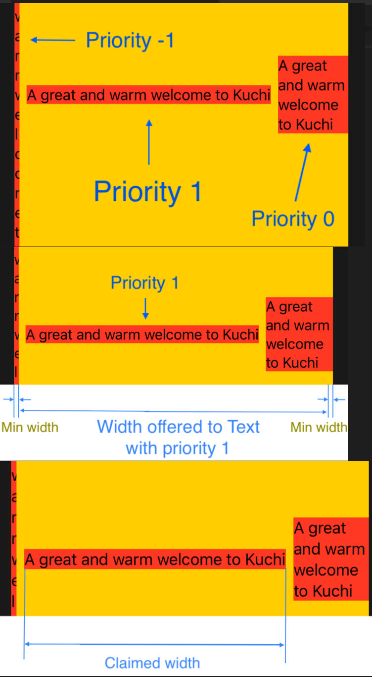 观察此图offered 和 claimed的宽度区别
LazyList
- 循环里不能用
for-in, 崦要用forEach, 因为它不支持表达式, 而forEach事实上就是一个view, 因而能写到some view里去 - List不能滚动起来, 要包到Scroll里去
- 需要表头, 就包到Section里去
- 需要固定表头, 则配置list的
pinnedViews入参
ScrollView {
  LazyVStack(
    Section(header: header) {
      ForEach(history, id: \.self) { element in
        createView(element)
      }
    }
  }
}
Functional user interface
- Being functional, rendering now always produces the same result given the same input,
- and changing the input automatically triggers an update. Connecting the right wires pushes data to the user interface, rather than the user interface having to pull data.
SwiftUI:
- Declarative: 声明式的UI
- Functional: 相同输入产生相同输出, 完全取决于状态
- Reactive: 响应式
State是什么
一个简单程序:
struct ContentView: View {
    @State private var isTapped = false
    // 1. var ctr = 0
    /* 2. 包到Struct里去
    struct mystruct {
      var ctr = 0
    }
    var state = mystruct()
    3. 改成class, 略
    4. 用一个包装器
    class Box<T> {
      var wrappedValue: T
      init(initialValue value: T) {
          self.wrappedValue = value
      }
    }
    var state = Box<Int>(initialValue: 0)
    5. 用State
    var state = State<Int>(initiaValue: 0) // 注意, State是一个struct, 比demo里用class的box要复杂
    6. 换个写法
    @State var state = 0
    */


    var body: some View {
        Button(action: {
          // 1. self.ctr += 1 // 报错, 因为不能从body内部改变属性的状态
          // 2. self.state.ctr += 1 // 报错, struct仍然是value type
          // 3. struct变成class, 不报错了, 但是显示的文字没有变化
          // 但是ctr的值确实变了, 因为指针指向的对象还是可变的
          // 如果这个视图有别的控件触发了这个视图的重绘, 会发现UI确实变了
          // 4. self.state.wrappedValue += 1 // 不报错, 但是显示的文字没有变化
          // 但是与3一样, 能在别的UI刷新后自身也刷新, 其实原理是一样的
          // 5. self.state.wrappedValue += 1 // 能响应点击事件并刷新UI了
          // 6. 最终写法, 所以6就是5的语法糖而已
          self.state += 1
        }) {
            // Text("\(self.ctr)")
            // Text("\(self.state.ctr)")
            // Text("\(self.state.wrappedValue)")
            Text("\(self.state)")
          }
        }
}
综上, State就跟我们模拟的Box一样, 封装了一个不可变对象, 但本身是一个class(不是的, 见下方注释), 所以能在view的body被改变它的成员变量(主要就是wrappedValue), 而且在body被改变时, 会自动触发UI的更新(这个是我们用Box)没有模拟出来的
即:
@State修饰的变量, 是一个可观察对象(能invalidate view)@State修饰的变量, 是不可变的(所以由State出面来包装)- 当它的值改变时, 会自动触发UI的更新
- 它会生成
State<T>的代码 - 并生成一个同名的带下划线的变量
- 也就是说, 你可以用
self.state来使用, 也可以用self._state.wrappedValue来使用
- 也就是说, 你可以用
官方定义: A property wrapper type that can read and write a value managed by SwiftUI.
SwiftUI manages the storage of any property you declare as a state. When the state value changes, the view invalidates its appearance and recomputes the body. Use the state as the single source of truth for a given view.
注意, Demo中的Box需要是一个对象, 但State是一个struct, 之所以能对struct的State进行变更, SwiftUI还做了别的工作.
Binding
SwiftUI希望你只有一份数据, 所有的地方都去读取它, 而不是复制它的值自己去用, 这样才能做到这个值改变的时候, 观察它的对象也能更新. 显然值类型就做不到这一点了, (事实上
Binding,State是特殊处理过的值类型)
- In SwiftUI, components don’t own the data — instead, they hold a reference to data that’s stored elsewhere.
- A binding is a two-way connection between a property that stores data, and a view that displays and changes the data.
- A binding connects a property to a source of truth stored elsewhere, instead of storing data directly.
@State用wrappedValue来读封装的值, 但要用projectdValue来bindview和数据源, 这样它接受来自UI的变更, 并且把数据源更新- 要传递一个状态对象(即不在本类定义, 而是别的地方定义的), 则要用
@Binding, 因为State仍然是一个值类型, 通过特殊处理, 能改变它的值了, 但是仍然会在传递的时候复制, 而@Binding则通过构造方法传入getter和setter的方式支持了读和写都对应同一个数据源
observation
- 值类型如struct改变任何一个属性都是一个全新的实例, 如果对它进行观察, 那所有的观察者都会重绘, 哪怕没有变动的属性
- 引用类型只有改变了指针才算改变, 对它进行观察则跟踪不到属性的变化
为了解决上面的问题, 引入了新的类型, 实现三个方向:
- 是一个引用类型
- 是一个可观察的类型
- 能定制可观察的属性
Sharing in the environment
-
Using
environmentObject(_:), you inject an object into the environment. -
Using
@EnvironmentObject, you pull an object (actually a reference to an object) out of the environment and store it in a property. -
注入后, 所有的子级及嵌套都能看到, 但父级及以上看不到
-
如果你注入的是未命名的对象, 则取出来的时候用类型即可
- 注入:
.environmentObject(ChallengesViewModel()) - 取出:
@EnvironmentObject var challengesViewModel: ChallengesViewModel
- 注入:
-
When you want a view to own an observable object, because it conceptually belongs to it, your tool is
@StateObject. -
When an observable object is owned elsewhere, either
@ObservedObjector@EnvironmentObjectare your tools — choosing one or the other depends from each specific case.
一些环境变量
@Environment(\.verticalSizeClass) var verticalSizeClass

if verticalSizeClass == .compact { // 横屏, 因为vertical compact的话, 就是竖向高度不够的意思

} else {}

// 你也可以随时改变环境变量
view.environment(\.verticalSizeClass, .compact)
- colorScheme
- locale
- 文档
注入命名环境变量
上面说的是未命名的, 你只能注入一个对象, 对类型取出来, 那么像verticalSizeClass这样的用keyPath类似的语法取出来的话, 这么做:
- 一个服从
EnvironmentKey的结构体(它只有一个defaultValue) - 在
EnvironmentValues的扩展里, 增加你要取的名字(keypath)的getter/setter
// 1.
struct QuestionsPerSessionKey: EnvironmentKey {
  static var defaultValue: Int = 5
}

// 2.
extension EnvironmentValues {
  var questionsPerSession: Int { // questionsPerSession 就是你要取的名字
    get { self[QuestionsPerSessionKey.self] }
    set { self[QuestionsPerSessionKey.self] = newValue }
  }
}

// 注入
someview().environment(\.questionsPerSession, 15)

// 使用(在someview里)
@Environment(\.questionsPerSession) var questionsPerSession
但是根据这个文档, 自定义环境变量更简单了, 使用Entry()宏即可
extension EnvironmentValues {
    @Entry var myCustomValue: String = "Default value" // 在我的15.4的xcode报错
}


extension View {
    func myCustomValue(_ myCustomValue: String) -> some View {
        environment(\.myCustomValue, myCustomValue)
    }
}
Controllers
DatePicker(
  "",
  selection: $dailyReminderTime,
  displayedComponents: .hourAndMinute
).datePickerStyle()
// CompactDatePickerStyle() -> (iOS default), 两个button, 点击后展开日历
// WheelDatePickerStyle
// GraphicalDatePickerStyle 日历, Mac下有个时钟
// FieldDatePickerStyle Mac, 文本框
// StepperFieldDatePickerStyle Mac, 可步进 (Mac default)

Toggle("Daily Reminder", isOn: $dailyReminderEnabled)
// 等同于如下, 如果有额外操作, 需要这样展开
Toggle("Daily Reminder", isOn:
  Binding(
    get: { dailyReminderEnabled },
    set: { newValue in
      dailyReminderEnabled = newValue
      // other biz
    }
  )
)

ColorPicker(
  "Card Background Color",
  selection: $cardBackgroundColor
)

// picker style: https://apple.co/3nyViIG
// 注意每个选项的label和id的传入方式
Picker("", selection: $appearance) {
  Text(Appearance.light.name).tag(Appearance.light)
  Text(Appearance.dark.name).tag(Appearance.dark)
  Text(Appearance.automatic.name).tag(Appearance.automatic)
}.pickerStyle(SegmentedPickerStyle()) // 默认是个list

// 如果是caseiterable:
ForEach(Appearance.allCases) { appearance in
  Text(appearance.name).tag(appearance)
}
TabView
TabView { // tabview
  SettingsView() // 具体页面
    .tabItem({ // 配置tab图标
      VStack {
        Image(systemName: "gear")
        Text("Settings")
      }
    })
    .tag(2)
}
.accentColor(.orange) // 高亮色
UserDefaults / App storage
@AppStorage("numberOfQuestions") var numberOfQuestions = 6

// 下面这种写法是只读的, 至于为什么也要初始化一下, 看后面有没有解答
@AppStorage("numberOfQuestions")
private(set) var numberOfQuestions = 6
以下类型能存到UserDefaults
- Basic types: Int, Double, String, Bool
- Composite types: Data, URL
- adopting
RawRepresentable
这是你支持自定义类型存入的方法:
- Make the type RawRepre
- Use a shadow property
RawRepresentbale
- 如果一个枚举的类型被定义为基础类型, 那么它自动服从了
RawRepresentable - 别的类型怎么实现
RawRepresentable尚未讲到
Shadow Property
比如一个Date类型, 是存不进的, 我们增加一个Double类型
@AppStorage("dailyReminderTime") var dailyReminderTimeShadow: Double = 0

// 上面实例化过一个DatePicker, 我们在setter里增加一个转换
DatePicker(
  "",
  selection: Binding(
    get: { dailyReminderTime },
    set: { newValue in
      dailyReminderTime = newValue
      dailyReminderTimeShadow = newValue.timeIntervalSince1970 // date -> double
      configureNotification()
    }
  ),
  displayedComponents: .hourAndMinute
)

// 在什么时候转回日期? .onAppear在每次显示的时候调用
.onAppear {
  dailyReminderTime = Date(timeIntervalSince1970: dailyReminderTimeShadow)
}
这么看来其实没什么新语法上的支持, 就是你只存UserDefaults支持的类型就好了, 由开发者自己来做这个转化的意思
Gesture
@GestureState会在手势完成后自动重置, @State不会
@GestureState var isLongPressed = false

let longPress = LongPressGesture()
  .updating($isLongPressed) { value, state, transition in
    state = value // 注意, binding value to state(你updating谁谁就是state)
  }
  .simultaneously(with: drag)
上面演示了绑定两个手势, 但如果是在不同的视图内的两个手势呢?
.gesture(TapGesture()
  ...
)
// 改为
.simultaneousGesture(TapGesture()
  ...
)
Navigation
- SwiftUI navigation organizes around two styles:
flatandhierarchical. - 分别对应
TabView和NavigationView - TabView
- tab图标只支持文字, 图片或者图片+文字(不需要用
VStack), 其它方式都会显示为空占位 - 所以对图片用modifier(比如旋转)也不行
- 假如要记下当前tab:
“@AppStorage("FlightStatusCurrentTab") var selectedTab = 1- 使用
TabView(selection: $selectedTab)会用指定的tab来初始化, 并且在tab切换的时候更新新的值 - 更新的值是每个view的
tag
- 使用
tabViewStyle(_:)可以改变转场方式
- tab图标只支持文字, 图片或者图片+文字(不需要用
- NavigationView
- 用
navigationBarTitle(_:)定义当前页标题 - 用
NavigationLink(destination:)导航- 导航链接用文字的话在第一参数, 用view的话是第二参数, 服从SwiftUI的规范
- 小屏
NavigationView默认用stack堆叠, 大屏默认用split分屏- 可以用
.navigationViewStyle(StackNavigationViewStyle())修改
- 可以用
- 环境变量要加给
NavigationView, 而不是任何一个子view
- 用
List
ForEach
List之前我们先看看ForEach
ForEach: provide datas output views (via clsoure)- It doesn't provide any structure
- so you should place it into a
VStack, and aScroll
- so you should place it into a
- 需要指定一个
Hashable的键(Swift的String和Int就可以)- 如果整个对象是
Hashable的, 那么\.self也行 - 如果整个对象是
Identifiable(from Swift5.1)的, 那么可以忽视掉这个参数
- 如果整个对象是
- 自行横向或纵向stack是没有内存优化的, 有多少实例化多少
Lazy版本就是解决这个的(首次appears实例化, 但不再会消失和复用)Lazy版本在垂直方向上是铺满空间的, 既如果是VStack, 那么横向是铺满的
ScrollView需要包一层ScrollViewReader来增强功能, 比如滚动定位- 也适用于Lazy版本, 即你能滚动到还没有渲染的元素去
- It doesn't provide any structure
ScrollViewReader demo
ScrollViewReader { scrollProxy in
  ScrollView {
    LazyVStack {
      ForEach(flights) { flight in
        NavigationLink(
          destination: FlightDetails(flight: flight)) {
          FlightRow(flight: flight)
        }
      }
    }
  }
  .onAppear {}
    DispatchQueue.main.asyncAfter(deadline: .now() + 0.05) {
      scrollProxy.scrollTo(nextFlightId, anchor: .center) // 用你for-each时候的id定位
  }
}
其实这种延迟0.05秒再运行的例子是很坏的实践, 因为这个0.05其实并没有任何保证
List
上面的例子用List改造一下
ScrollViewReader { scrollProxy in
  List(flights) { flight in // 帮助做了Scroll+LazyVStack
    NavigationLink(
      destination: FlightDetails(flight: flight)) {
      FlightRow(flight: flight)
    }
  }.onAppear {
    DispatchQueue.main.asyncAfter(deadline: .now() + 0.05) {
      scrollProxy.scrollTo(nextFlightId, anchor: .center)
    }
  }
}
ForEachallows you to iterate over almost any collection of data and create a view for each element.Listacts much as a more specific case of ForEach to display rows of one-column data
层级List, 看示例, 简单到犯规(前提是结构是递归的),
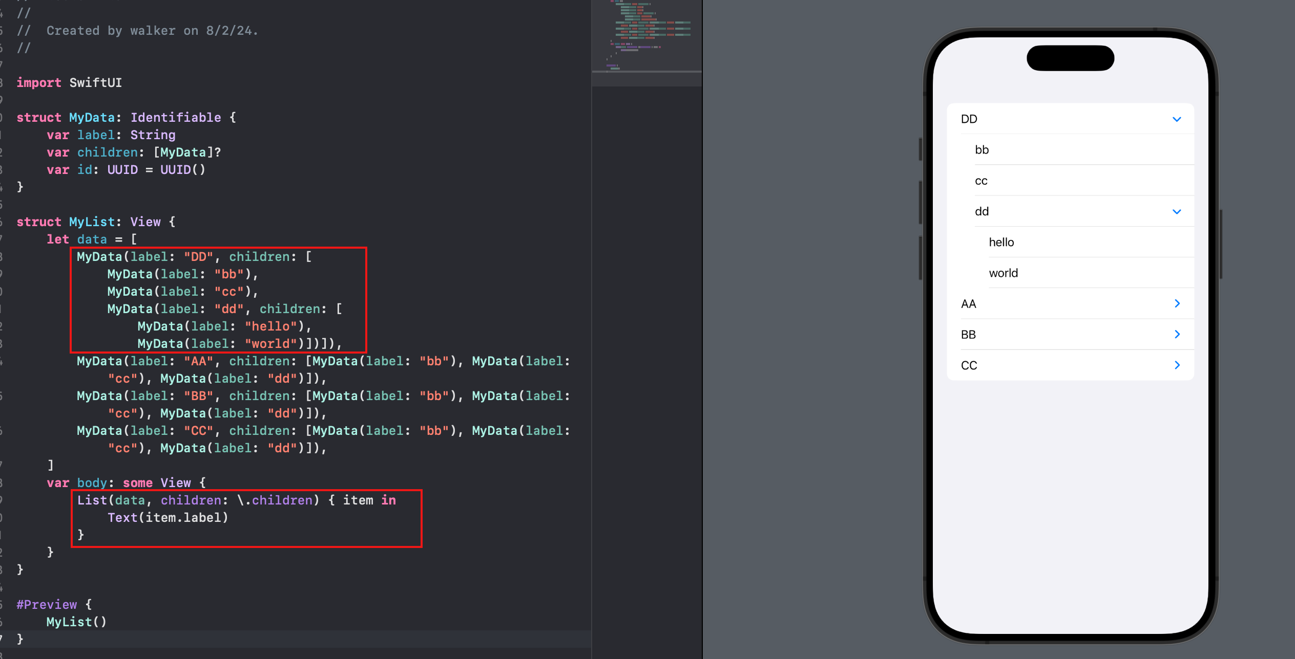 当然要自定义还是有点功夫的, 至少目录和内容的行为是不可能一致的, 所以你在List的view builder里, 至少要做一个if-else
分组和更多个性化, 就不能用上面的全自动代码了, 改一下:
List {
    ForEach(data) { item in
        Section(header: Text(item.label), footer: HStack {
            Spacer()
            Text("footer")
        }) {
            ForEach(item.children!) { child in
                Text(child.label)
            }
        }
    }
}.listStyle(InsetGroupedListStyle())
- List后不跟数据, 而是自行
ForEach>>> 最终还得靠ForEach - 想要分组, 就再跟上
Section, 这样就把title和children分离了 - 标题, 页脚等, 属于
Section的内容
Grid
LazyVGrid和LayHGrid, 本质上就是一个主轴和交叉轴分别应用LazyVStack和LazyHStack
var awardColumns: [GridItem] {
  [GridItem(.flexible(minimum: 150)), // .fixed, .flexible
  GridItem(.flexible(minimum: 150))] // 表示了能做多宽做多宽
}

LazyVGrid(columns: awardColumns) {
  ForEach(awardArray, id: \.self) { award in
    NavigationLink(destination: AwardDetails(award: award)) {
      AwardCardView(award: award)
        .foregroundColor(.black)
        .frame(width: 150, height: 220) // view本身限制了150宽,与column配置不冲突
    }
  }
}
- 上例中, 用最小值150 + 自定义值150 限定了cell的宽度, 结果跟直接用
.fixed(150)是一致的 - 但是这种写法就能支持不同cell有不同的宽度
- 如果你设置了最大宽, 但自定义值大于最大值怎么办?
- 元素会保持设置的大小, 但是布局系统会按griditem的配置来布局
- 内容是缩放还是裁剪, 取决于aspectRatio配置
GridItem(.flexible(minimum: 150, maximum: 170))
card.aspectRatio(0.67, contentMode: .fit)
思考:
columns(HGrid中则是rows)数组的个数决定了每一行摆放的元素个数, 那么如果需要不定个数的自动折行怎么实现?[GridItem(.adaptive(minimum: 150, maximum: 170))]
但是实测不尽如人意:
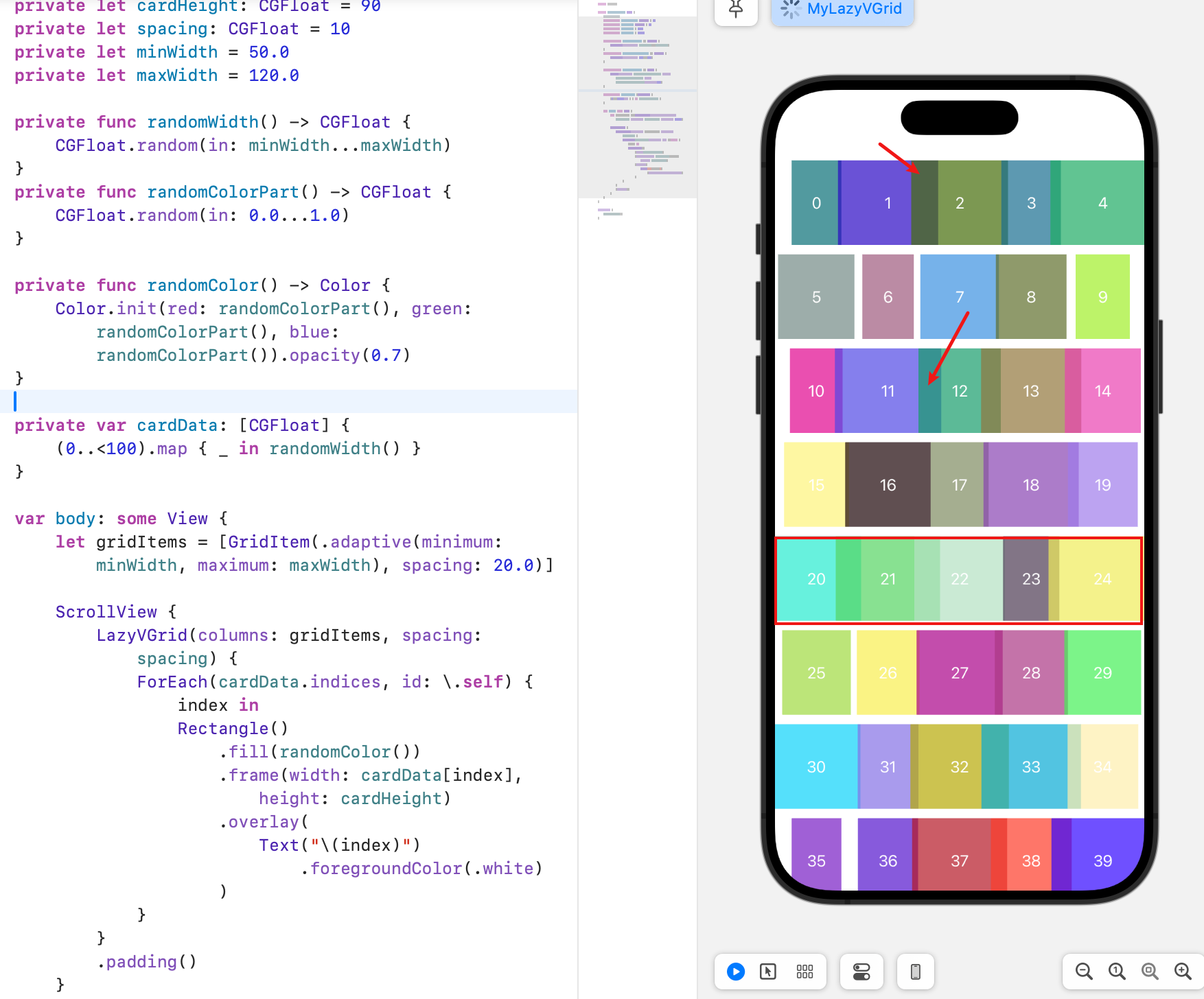
- 注意到重叠了没? 不知道为什么它一排总要放5个
- 而且每行数量是一样的
- 通过更改min/max的大小, 一行的个数也会增减, 可见应该是由第一行的个数决定的
说明.adaptive并不能像CollectionView的FlowLayout一样计算每个元素的位置
原因是
grid毕竟是grid, 它是一个表格, 不可能每行的列数不一样, 我想要的流式布局, 一般理解为"可换行的HStack", 以下有几个三方库和几个so讨论可以借鉴下:
- 讨论1
- 讨论2
- SwiftUI Flow, 支持HFlow和VFlow
- WrappingHStack
嵌套使用
如果你写了一个grid, 想给它分组怎么办? 之前是一个LazyVGrid里直接添加N个View, 现在用Section分一下组就行
struct AwardGrid: View {
  // 1
  var title: String
  var awards: [AwardInformation]

  var body: some View {
    // 2
    Section(
      // 3
      header: Text(title)
        .font(.title)
        .foregroundColor(.white)
    ) {
      // 4
      ForEach(awards, id: \.self) { award in
        NavigationLink(
          destination: AwardDetails(award: award)) {
          AwardCardView(award: award)
            .foregroundColor(.black)
            .aspectRatio(0.67, contentMode: .fit)
        }
      }
    }
  }
}
// 使用
LazyVGrid(columns: awardColumns) {
  AwardGrid(
    title: "Awarded",
    awards: activeAwards
  )
  AwardGrid(
    title: "Not Awarded",
    awards: inactiveAwards
  )
}
AwardGrid只是封装出来了, 本质上还是一个Section, 它的有效元素仍然是一堆View- 所以就把原始结构由views变成了sections,
LazyVGrid的所有属性会透过section传给view来布局, 而不是去布局section - 但是section就是简单地从上到下排列, 可以理解为
LazyVStack
教程里有这么一句话, 但没有实例: You can mix different types of grid items in the same row or column. 如何能做到
.fixed,.flexible和.adaptive作用在同一行的?
Sheets & Alert Views
- 是在导航逻辑之外的独立UI
- 目的就是阻断用户的操作, 引起用户必要的注意
- SwiftUI provides two ways to display a modal, both based on a
@Statevariable in the view.- 一种是
Bool值, 为True就显示 - 一种是为
non nil就显示
- 一种是
- 共提供了四种modal:
- sheet
- alert
- action sheet (deprecated) -> confirmationDialog
- popover (大屏才有意义, 小屏直接全屏sheet就好了)
// sheet
Button(
  action: {
    isPresented.toggle()
  }, label: {
    Text("toggle sheet")
  })
  .sheet(
    isPresented: $isPresented,
    onDismiss: {
      print("Modal dismissed. State now: \(self.isPresented)")
    },
    content: {
        EmptyView()
    }
  )
- 如果是第一次使用, 那你只能习惯这种用法, 在很久以前的
bootstrap就用了这种方式来做交互 sheet没法独立定义在哪供你show出来, 只能用modifier的方式挂在一个视图后面- 但是挂在任一视图后面就行了, 不是一定要像demo那样跟在触发的按钮后面
- 其实你也能猜到, 任何地方都吧可以触发
isPresented的变化
- 其实你也能猜到, 任何地方都吧可以触发
- You can create a ne˜w navigation view on the modal, but it makes an entirely new navigation view stack.
// alert
Button("toggle alert") {
  isPresented.toggle()
}
.alert(
  isPresented: $isPresented {
    Alert(
      title: Text("Alert"),
      message: Text("This is an alert"),
      dismissButton: .default(Text("OK"))
    )
  }
)
用法是一样的, 你只需要把它挂到一个view语句后面, 声明有这个么视图即可
// action sheet
Button("toggle action sheet") {
  isPresented.toggle()
}
.actionSheet(
  isPresented: $isPresented,
  buttons: [
    .default(Text("Default")),
    .destructive(Text("Destructive")),
    .cancel(Text("Cancel"))
  ]
)
actionSheet的buttons是一个数组, 你可以定义多个按钮, 每个按钮可以定义Text和stylestyle有三种,default,destructive,cancel, 其中cancel是默认的, 不用定义default和destructive的区别是颜色,destructive是红色,default是蓝色
但是actionSheet已经过时了, 用confirmationDialog
// confirmation dialog
Button("toggle action sheet") {
  isAction.toggle()
}
.confirmationDialog("action", isPresented: $isAction, titleVisibility: .visible) {
    Button("one"){}
    Button("two"){}
    Button("cancel", role: .cancel){}
    Button("delete", role: .destructive){}
}
confirmationDialog的actions闭包里返回一个数组, 数组里是多个Button- 参考这篇文章看个性化的sheet action
// popover
Button("toggle popover") {
  isPresented.toggle()
}
.popover(
  isPresented: $isPresented,
  attachmentAnchor: .point(.bottom, alignment: .center),
  arrowEdge: .bottom,
  content: {
    Text("Popover") // popover的视图是自定义的, 就是一个小弹窗而已
  }
)
Drawing & Custom Graphics
- One of the basic drawing structures in SwiftUI is the Shape
- A shape is a special type of view.
- By default, SwiftUI renders graphics and animations using
CoreGraphics.
如果因为绘制造成效率低下: you can use the
drawingGroup()modifier on your view. This modifier tells SwiftUI to combine the view’s contents into an offscreen image before the final display. (Metal的特性)
- drawingGroup() modifier only works for graphics — shapes, images, text, etc.
- offscreen composition adds overheard and results in slower performance for simple graphics
Using GeometryReader
The GeometryReader container provides a way to get the size and shape of a view from within it.
HStack {
  Text("\(history.day) day(s) ago")
    .frame(width: 110, alignment: .trailing)
  // 只在需要的时候才包GeometryReader, 没必要包在最外层
  GeometryReader { proxy in
    Rectangle()
      .foregroundColor(history.delayColor)
      .frame(width: minuteLength(history.timeDifference, proxy: proxy))
      .offset(x: minuteOffset(history.timeDifference, proxy: proxy))
  }
}
.padding()
.background(
  Color.white.opacity(0.2)
)
上例是一个bar chart的demo, 左边text, 右边矩形做bar, 为了让每个值对应成屏幕上的像素点(类似于比例尺), 就需要知道容器的真实大小.
有这么句话: There's no need to wrap the two elements inside a ZStack when using shapes inside a GeometryReader. 书中的例子是给bar上加刻度条, 因为是在
GeometryReader里, 给了offset和frame就行了, 都会在bar上面绘制, 个人认为就是在GeometryReader的size里绘制的意思, 因为是绘制, 所以就无所谓ZStack了, 关心的只有绘制的坐标.
Gradients
LinearGradient(gradient: Gradient(colors: [.red, .yellow]), startPoint: .leading, endPoint: .trailing)
LinearGradient是线性渐变,RadialGradient是径向渐变- 你需要构造一个
Gradient对象, 然后传给LinearGradient或RadialGradient, 等于一个是配置颜色, 一个是配置如何用这些颜色
Shapes
RectangleCircleEllipseRoundedRectangleCapsule以下这些shape是AI自动生成的, 我保留下来以后看看有没有生造出一些shape出来TriangleRegularPolygonPolygonArcBezierPathPathShapeInsettableShapeShapeStylePathStyleShapeViewShapeViewStyleShapeStyleView
圆角边框
要实现圆角边框, 你能用到的方式有:
CornerRadius+ overlayRoundedRectangle.strokeCornerRadius+ borderClipShapeRoundedRectangle + overlayRoundedRectangle.stroke
其实就是圆角, 你是选择ClipShape还是CornerRadius; 边框, 你是选择Border还是Overlay.
Paths
因为用的都是CoreGraphics, 语法都差不多:
GeometryReader { proxy in
  let radius = min(proxy.size.width, proxy.size.height) / 2.0
  let center = CGPoint(x: proxy.size.width / 2.0, y: proxy.size.height / 2.0)
  var startAngle = 360.0
  ForEach(pieElements) { segment in
    let endAngle = startAngle - segment.fraction * 360.0
    Path { pieChart in
      pieChart.move(to: center)
      pieChart.addArc(
        center: center,
        radius: radius,
        startAngle: .degrees(startAngle),
        endAngle: .degrees(endAngle),
        clockwise: true
      )
      pieChart.closeSubpath()
      startAngle = endAngle
    }
    .foregroundColor(segment.color)
  }
}
连续画折线的话, 可以直接传入一个坐标数组
Path { path in
    path.addLines([
        CGPoint(x: 0, y: 128),
        CGPoint(x: 142, y: 128),
        CGPoint(x: 142, y: 70)
      ])
}.stroke(Color.blue, lineWidth: 3.0)
Animations & View Transitions
- In SwiftUI, you just tell SwiftUI the type of animation, and it handles the interpolation for you.
Image()
.rotationEffect(.degrees(showTerminal ? 90 : -90)) // 没有动画
.animation(.linear(duration: 1.0)) // 对上面的effect进行动画
.animation(Animation.default.speed(0.33)) // 减慢速度
'animation' was deprecated in iOS 15.0: Use withAnimation or animation(_:value:) instead.
Eased animations
Animation.default就是easeInOut(默认时间是0.35秒)- If you need fine control over the animation curve's shape, you can use the
timingCurve(_:_:_:_)type method.- 四个参数就是塞塞尔曲线的两个控制点的坐标, 范围是0到1
Spring animations
- eased animations是单向的, 在快结束的时候加点bounce, 就叫sping
.animation(
  .interpolatingSpring(
    mass: 1,
    stiffness: 100,
    damping: 10,
    initialVelocity: 0
  )
)
-
mass: Controls how long the system "bounces". -
stiffness: Controls the speed of the initial movement. -
damping: Controls how fast the system slows down and stops. -
initialVelocity: Gives an extra initial motion. -
质量越大,动画持续的时间越长,在端点两侧弹跳的距离越远。质量越小,停止的速度越快,每次弹跳经过端点的距离也越短。
-
增加刚度会使每次弹跳都更远地越过端点,但对动画长度的影响较小。
-
增加阻尼会使动画更快平滑和结束。
-
增加初速度会使动画弹跳得更远。负的初速度会使动画向相反方向移动,直到克服初速度为止
.animation(
  .spring(
    response: 0.55, // 定义一个周期的时长
    dampingFraction: 0.45, // 控制弹力的停止速度, 0是不停止, 1等于弹不动
    blendDuration: 0
  )
)
"blendDuration "参数用于控制不同动画之间的混合过渡长度。只有在动画过程中更改参数或组合多个弹簧动画时才会使用该参数。如果值为零,则会关闭混合功能。
- 如果你又加了个effect:
.scaleEffect(showTerminal ? 1.5 : 1.0), 那么这个scaleEffect也会被动画化, - 你想要立刻生效, 不要动画, 那就得注意先后, 把不需要动画的effect写在前面, 然后跟上
.animation(nil) - 如果你把nil动画改成了另一个动画, 比如
.animation(.linear(duration: 1.0)), 那么两个effect就应用了各自的动画simultaneously and blend smoothly
也就是说, 为每个effect做一个animation
Animating multiple properties
- 如果你想让两个属性同时动画化, 那么需要用
withAnimation来包裹这两个属性
withAnimation(.spring(response: 0.55, dampingFraction: 0.45, blendDuration: 0)) {
  // 两个动画同步
}
Animating from state changes
除了对effect动画, 你也可以对state变化进行动画化. 上面的条形图例子中, 图形是立即绘制的, 我们加个条件:
@State private var showBars = CGFloat(0)

// 改一个通过geometryProxy来获取长度的方法, 即原本计算的长度, 再乘这个showbars(要么是0, 要么是1), 略

// appear的时候加入这个条件, 即对showBars这个属性的变化进行相应的动画
// 到了bar布局容器VStack上:
.onAppear {
  withAnimation(Animation.default.delay(0.5)) {
    self.showBars = CGFloat(1)
  }
}
// 或者手动触发
Button(action: {
  withAnimation {
    self.showBars = CGFloat(1)
  }
}) {
  Text("Show Bars")
}
Animating changes to the view's appearance
- The
delay()method also gives you a method to make animations appear to connect.
// 把上面在`onAppear`方法里写动画的代码改为只设属性
.onAppear {
  showBars = true
}
// 然后再对每条bar animation的时候延迟一点
// 顺便对index进行迭代, 这样越靠后的bar动画延迟得越久, 造成先后绘制的效果
.animation(
  Animation.easeInOut.delay(index * 0.1)
)
自定义动画
- 主要就是通过控制动画的进度来实现
- SwiftUI提供
Animatable protocol, 实现animatableData来描述当前进度即可 - 它是一个服务
VectorArithmetic协议的类型 - 但是对于
Path, 它有一个trim方法能控制path绘制的进度,trim方法接受一个from和一个to, 任意一个是state的话, 就能在state变化的时候触发动画
@State private var showPath = false

Path { path in
  path.addLines([
      CGPoint(x: 0, y: 0),
      CGPoint(x: 0, y: 128),
      CGPoint(x: 142, y: 128),
      CGPoint(x: 142, y: 70)
  ])
}
.trim(to: showPath ? 1.0 : 0.0) // 这里
.stroke(Color.blue, lineWidth: 3.0)
.animation(.easeInOut(duration: 3.0), value: UUID())
.onAppear {
  showPath = true
}
灵活运用trim的
from和to的组合, 可以实现很多效果, 比如倒放, 消除等, 自己多试试, 对from进行切换会有很多意想不到的效果哦
.trim(from: 0.0, to: showPath ? 1.0 : 0.0)正向绘制.trim(from: showPath ? 0.0 : 1.0, to: 1.0)逆向绘制.trim(from: 0.0, to: showPath ? 0.0 : 1.0)擦除
Animating view transitions
Note: Transitions often render incorrectly in the preview. If you do not see what you expect, try running the app in the simulator or on a device.
transition是动画化view hierarchy的变化, 比如一个view从屏幕上消失, 另一个view出现, 或者一个view被替换成另一个view- Transitions are specific animations that occur when showing and hiding views.
// 这个叫State change
Text(
  showTerminal ?
  "Hide Terminal Map" :
  "Show Terminal Map"
)
// 这个叫View transition
if showTerminal {
  Text("Hide Terminal Map")
} else {
  Text("Show Terminal Map")
}
任意可以选择性选择不同view的地方, 都可以加上transition
Group { // 首先用Group包一下
  if showTerminal {
    Text("Hide Terminal Map")
  } else {
    Text("Show Terminal Map")
  }
}
.transition(.slide)
opacity: 淡入或淡出(默认)slide: 从屏幕的一侧滑入或滑出scale: 缩放进入或缩放离开,scale入参是initialvalue,anchor是锚点, 默认是.centermove(edge: .bottom): 从屏幕的底部滑入或滑出
但是它不会自动在属性变化的时候生效, 需要手动触发
Button(action: {
  withAnimation { // 需要用withAnimation来包裹
    self.showTerminal.toggle()
  }
}) {
  // 刚刚那个group的views可以放这里
}
这个就有点像UIKit的animation方法了, 把属性的变化包到动画方法里.
Customizing transitions
transition可以接受一个参数,transition(_:animation:)方法, 第一个参数是transition的类型, 第二个参数是动画的配置transition(_:animation:)方法可以接受一个Animation对象, 也可以接受一个Animation的闭包
// 传入一个Animation对象
.transition(.slide, animation: .easeInOut(duration: 1.0))
// 传入一个Animation的闭包
.transition(.slide, animation: Animation.easeInOut(duration: 1.0))
组合
extension AnyTransition {
  static var buttonNameTransition: AnyTransition {
    let insertion = AnyTransition.move(edge: .trailing)
      .combined(with: .opacity)
    let removal = AnyTransition.scale(scale: 0.0)
      .combined(with: .opacity)
    return .asymmetric(insertion: insertion, removal: removal)
  }
}
- 用
bombined来支持多个动画的组合 - 用
asymmetric来配置呈现和消失时不同的动画
Linking view transitions
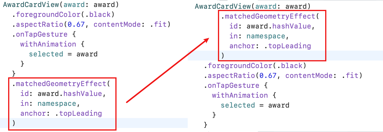
两个视图, 在同一个state切换状态时, 一个显示, 一个消失, 这两个动画没关关联, 可以用matchedGeometryEffect让它同步起来
You only must specify the first two parameters.
- The
iduniquely identifies a connection and giving two items the same id links their animations. - You pass a Namespace to the in property. The namespace groups related items, and the two together define unique links between views.
- 定义:
@Namespace var namespace - 接参:
var namespace: Namespace.ID - preview里需要手动传下:
@Namespace static var namespace
- 定义:
添加这个方法的仍然是你想要动画的View上, 下面的截图演示了它的位置并不影响别的modifier:
ViewBuilder
如果想把这个视图改造成组件:
ForEach(flights) { flight in
  FlightCardView(flight: flight)
}
简单自定义一个view就行, 把视图写到body方法里, 但是如果FlightCardView这个也要拿出去自定义怎么办? 其实就是把block用ViewBuilder标记一下来做入参:
struct GenericTimeline<Content>: View where Content: View {

  let flights: [FlightInformation]
  let content: (FlightInformation) -> Content

  init(
    flights: [FlightInformation],
    @ViewBuilder content: @escaping (FlightInformation) -> Content
  )

  var body: some View {
    ScrollView {
      VStack {
        ForEach(flights) { flight in
          content(flight)
        }
      }
    }
  }
}
- 以上做了一个视图, 接受一个数组, 但是没有帮你生成视图, 而是让你传入应该生成怎样的视图
- 这在用同样的数据源产生不同的UI的场景适用
<Content>是泛型, 字面文字并不重要, 主要是个占位, 有多个泛型就在<>里写多个占位符
使用
GenericTimeline(
  flights: mydata
) { flight in
  FlightCardView(flight: flight) // create your view
}
多个泛型:
struct GenericTimeline<Content, T>: View where Content: View {
  var events: [T]
  let content: (T) -> Content

  init(
    events: [T],
    @ViewBuilder content: @escaping (T) -> Content
  ) {
    self.events = events
    self.content = content
  }

  var body: some View {
    ScrollView {
      VStack {
        ForEach(events.indices) { index in
          content(events[index])
        }
      }
    }
  }
}
ForEach的是events的indices而不是它本身, 因为泛型T不能保证Identifiable
- 所以也可以在
where时约束一下:where Content: View, T: Identifiable
- 上面有了两个泛型, 再次声明, 泛型的名字不重要, 自己试下, 把
Content全部换成V, 这样就是V, T两个泛型, 一个是View, 一个是identifiable.
使用
GenericTimeline(events: flights) { flight in
  FlightCardView(flight: flight) // create your view
}
KeyPaths
KeyPath是Swift的反射机制, 可以用来获取对象的属性, 比如获取FlightInformation的id属性:
struct FlightInformation: Identifiable {
  let id = UUID()
  let name: String
  let origin: String
  let destination: String
  let departure: Date
  let arrival: Date
}
用KeyPath获取id属性:
let idKeyPath = \FlightInformation.id
KeyPath可以用来做ForEach的id参数:
GenericTimeline(events: flights, id: \.id) { flight in
  FlightCardView(flight: flight) // create your view
}
如果用的是\.id, 则可以省略.
说回demo, 如果我们UI需要取泛型T的一个字段来呈现, 但又不确定是哪个字段(一般这种情况, 可能直接设计为传值, 而不是字段), 我们可以把keypath传进来:
let timeProperty: KeyPath<T, Date>
声明keypath需要两个属性:
T是说明查找keypath的对象的类型Date的意思是T的keypath的目标类型是Date
所以添加一个属性:
struct GenericTimeline<Content, T>: View where Content: View, T: Identifiable, T: Comparable {
  var events: [T]
  let timeProperty: KeyPath<T, Date>
  let content: (T) -> Content

  init(
    events: [T],
    timeProperty: KeyPath<T, Date>,
    @ViewBuilder content: @escaping (T) -> Content
  ) {
    ...
  }
}

// 实例化时多了一个属性:
timeProperty: \.localTime
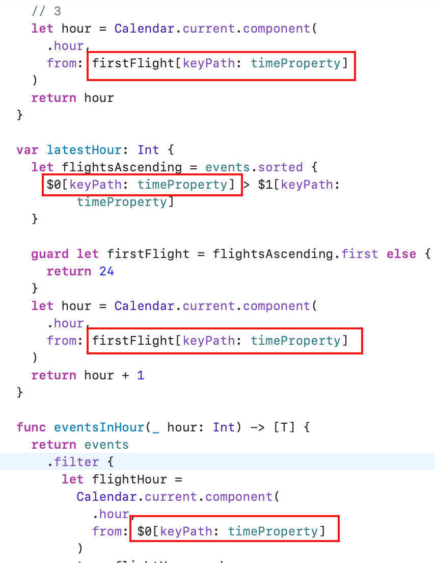
传进来是为了用, 直接看看截图吧
 如果是OC, 可能要简单很多, 直接用字符串就行了, swift的更安全.
个人觉得例子举得不好, 都泛型了, 还一定要用它的某个属性来写逻辑, 那有何意义? 不过教程只是为了演示用法, 真实场景还得自己把握.
Integrating with other frameworks
- To work with UIViews and UIViewControllers in SwiftUI, you must create types that conform to the
UIViewRepresentableandUIViewControllerRepresentableprotocols. (取决于三方组件是view还是controller) - There are two methods in the
UIViewControllerRepresentableprotocol you will need to implement:makeUIViewController(context:), andupdateUIViewController(_:context:).- 其实是三个, 概述一下就是
makeView,makeCoordinator和updateUIView
- 其实是三个, 概述一下就是
以连接MapKit为例:
- makeUIView里需要返回mapkit
- updateUIView里需要更新mapkit
- makeCoordinator里需要返回一个coordinator, 这个coordinator需要实现
MKMapViewDelegate协议
struct MapView: UIViewRepresentable {
  func makeUIView(context: Context) -> MKMapView {
    MKMapView(frame: .zero)
  }

  func updateUIView(_ view: MKMapView, context: Context) {
    let coordinate = CLLocationCoordinate2D(latitude: 34.011286, longitude: -116.166868)
    // 定义和添加一系列coordinate, overlay和polyline
    // 以期在coordinator的代理方法里处理成真实的绘制
  }

  func makeCoordinator() -> Coordinator {
    MapCoordinator(self)
  }

  class MapCoordinator: NSObject, MKMapViewDelegate {
    var control: MapView // 这里一定要注意, 指回去了

    init(_ control: MapView) {
      self.control = control
    }
  }
  extension MapCoordinator: MKMapViewDelegate {
    func mapViewDidChangeVisibleRegion(_ mapView: MKMapView) {
      // 处理绘制
    }

  // 绘制circle和连线的代理方法
  func mapView(
      _ mapView: MKMapView,
      rendererFor overlay: MKOverlay
    ) -> MKOverlayRenderer {
      if overlay is MKCircle {
        let renderer = MKCircleRenderer(overlay: overlay)
        renderer.fillColor = UIColor.black
        renderer.strokeColor = UIColor.black
        return renderer
      }

      if overlay is MKGeodesicPolyline {
        let renderer = MKPolylineRenderer(overlay: overlay)
        renderer.strokeColor = UIColor(
          red: 0.0,
          green: 0.0,
          blue: 1.0,
          alpha: 0.3
        )
        renderer.lineWidth = 3.0
        renderer.strokeStart = 0.0
        renderer.strokeEnd = fraction
        return renderer
      }

      return MKOverlayRenderer()
    }
  }
}
MacOS app
略