HarmonyOS NEXT 中级
动画
- 属性动画, 转卖动画
- 应用内转场尽量不要调起别的UIAbility,而是自行写组件然后跳转,不然会增加额外的独立任务
- 不可动画属性:zIndex、focusable, enalbed等(即基本上不可插值)
- 变化过程中参数值并非绝对的连续,而是具有一定的离散性。但由于人眼会产生视觉暂留
- UI的一次改变称为一个动画帧,对应一次屏幕刷新。
- ArkUI提供
@AnimatableExtend装饰器用于自定义可动画属性 - 属性动画应该作用于始终存在的组件,对于将要出现或者将要消失的组件的动画应该使用转场动画。
- 尽量不要使用动画结束回调。属性动画是对已经发生的状态进行的动画,不需要开发者去处理结束的逻辑。如果要使用结束回调,一定要正确处理连续操作的数据管理。
观察以下动画
 右边的红矩形不会在蓝色矩形旋转过程中自动让出位置,所以其实就是三个可变属性:
- 旋转角度
- 透明度
- 偏移量(其实就是对角线比边长多出的部分)
属性动画
对于一直存在的组件, 用属性动画,对于即将出现或者消失的组件,用转场动画
animateTo
类似iOS的animate方法,直接在闭包内设置状态终止值即可
import { curves } from '@kit.ArkUI';

@Entry
@Component
struct AnimateToDemo {
  @State animate: boolean = false;
  // 第一步: 声明相关状态变量
  @State rotateValue: number = 0; // 组件一旋转角度
  @State translateX: number = 0; // 组件二偏移量
  @State opacityValue: number = 1; // 组件二透明度

  // 第二步:将状态变量设置到相关可动画属性接口
  build() {
    Row() {
      // 组件一
      Column() {
      }
      .rotate({ angle: this.rotateValue })
      .backgroundColor('#317AF7')
      .justifyContent(FlexAlign.Center)
      .width(100)
      .height(100)
      .borderRadius(30)
      .onClick(() => {
        this.getUIContext()?.animateTo({ curve: curves.springMotion() }, () => {
          this.animate = !this.animate;
          this.rotateValue = this.animate ? 90 : 0;
          this.opacityValue = this.animate ? 0.6 : 1;
          this.translateX = this.animate ? 50 : 0;
        })
      })

      // 组件二
      Column() {

      }
      .justifyContent(FlexAlign.Center)
      .width(100)
      .height(100)
      .backgroundColor('#D94838')
      .borderRadius(30)
      .opacity(this.opacityValue)
      .translate({ x: this.translateX })
    }
    .width('100%')
    .height('100%')
    .justifyContent(FlexAlign.Center)
  }
}
animate这个属性在这个例子里是没用的
animation
需要设置一下animation属性,然后会在每次状态改变时自动应用这里配置的属性
@State animate: boolean = false;
build() {
  ...
  Column() {}
  .animation({curve: curves.springMotion()})
  .onClick(() => {
    this.animate = !this.animate;
    this.rotateValue = this.animate ? 90 : 0;
    this.translateX = this.animate ? 50 : 0;
    this.opacityValue = this.animate ? 0.6 : 1;
  })
  Column() {}
  .translate({ x: this.translateX })
  .animation({ curve: curves.springMotion() })
  ...
}
keyframeAnimateTo
.onClick(() => {
  this.getUIContext()?.keyframeAnimateTo({
    iterations: 1
  }, [
    {
      // 第一段关键帧动画时长为800ms,组件一顺时针旋转90度,组件二的透明度变从1变为0.6,组件二的translate从0位移到50
      duration: 800,
      event: () => {
        this.rotateValue = 90;
        this.opacityValue = 0.6;
        this.translateX = 50;
      }
    },
    {
      // 第二段关键帧动画时长为500ms,组件一逆时针旋转90度恢复至0度,组件二的透明度变从0.6变为1,组件二的translate从50位移到0
      duration: 500,
      event: () => {
        this.rotateValue = 0;
        this.opacityValue = 1;
        this.translateX = 0;
      }
    }
  ]);
})
可见, 关键帧里只需要用event来定义状态变化即可. 但这不是一个好例子,它只是做了一个往复动画, 演示关键帧最好是把一个单程动画拆成多段
转场动画
- 使用导航转场Navigaition实现页面间转场动画以及自定义导航转场动画。
- 使用bindSheet实现模态转场动画。
- 使用transition属性实现组件内转场动画。
- 使用geometryTransition实现共享元素转场动画及一镜到底动效。
组件内转场用transition属性, 注意需要成对出现"出现"和"消失"的转场设置, 这点跟SwiftUI很像.
@Component
export struct ComponentTransition {
  @State isShow: boolean = false;
  appearEffect = TransitionEffect.scale({ x: 0, y: 0 }).combine(TransitionEffect.OPACITY);
  disappearEffect = TransitionEffect.rotate({ x: 0, y: 1, z: 0, angle: 360 }).combine(TransitionEffect.OPACITY);

  build() {
    NavDestination() {
      Column() {
        if (this.isShow) {
          Image($r('app.media.bg_element'))
            .TransitionEleStyles()
            .transition(TransitionEffect.asymmetric(this.appearEffect, this.disappearEffect))
        }
        Image($r('app.media.bg_element'))
          // ...
      }
      .padding(16)
      .height('100%')
      .width('100%')
    }
    .title(getResourceString($r('app.string.title_component_transition'), getContext(this)))
  }
}
共享元素转场通过给组件设置geometryTransition属性来实现,相同或者相似的两个组件配置为同一个id,则转场过程中会执行共享元素转场。
// entry/src/main/ets/pages/geometrytransition/GeometryTransition.ets
import { GEOMETRY_TRANSITION_ID } from '../../constants/CommonConstants';

Column() {
  Image($r('app.media.bg_transition'))
    .width('100%')
    .height(147)
    .borderRadius(8)
    .margin({ bottom: 12 })
    .geometryTransition(GEOMETRY_TRANSITION_ID)
    // ...
}

// entry/src/main/ets/pages/geometrytransition/GeometryTransitionDetail.ets
import { GEOMETRY_TRANSITION_ID } from '../../constants/CommonConstants';

NavDestination() {
  Image($r('app.media.bg_transition'))
    .width('100%')
    .height('60%')
    .margin({ top: 12 })
    .geometryTransition(GEOMETRY_TRANSITION_ID)
}
触发的话, 把push nav stack放到animateTo里即可, 这是我没想到的:
.onClick(() => {
  this.getUIContext().animateTo({ duration: 600 }, () => {
    this.navPageInfos.pushPath({ name: 'GeometryTransitionDetail' }, false);
  });
})

// 返回也是:
NavDestination() {
  Image($r('app.media.bg_transition'))
}
.transition(TransitionEffect.OPACITY)
.title('xxx')
.onBackPressed(() => {
  this.getUIContext().animateTo({ duration: 600 }, () => {
    this.navPageInfos.pop(false);
  });
  return true;
})
弹窗
- Dialog、Popup、Menu、OverlayManager、Toast、bindSheet以及bindContentCover都是弹窗。
- Toast属于“非模态弹窗“
前提条件(约束)
- 可以通过调用UIContext或getUIContext,在非UI页面或某些异步回调中使用本文中的接口。CalendarPickerDialog当前不支持此操作。
- 操作菜单 (showActionMenu)、对话框 (showDialog)需先使用UIContext中的getPromptAction()方法获取到PromptAction对象,再通过该对象调用对应方法。
- 列表选择弹出框 (ActionSheet)、警告弹出框 (AlertDialog)、选择器弹出框 (PickerDialog)中除CalendarPickerDialog都需先使用ohos.window中的getUIContext()方法获取UIContext实例,再通过此实例调用对应方法。或者可以通过自定义组件内置方法getUIContext()获取。
固定样式弹窗
- 固定样式弹出框采用固定的布局格式
- 生命周期:onWillAppear -> onDidAppear -> onWillDisappear -> onDidDisappear
showActionMenu
操作菜单通过UIContext中的getPromptAction方法获取到PromptAction对象,再通过该对象调用showActionMenu接口实现,支持在回调或开发者自定义类中使用。
import { PromptAction } from '@kit.ArkUI';

@Entry
@Component
struct Index {
  promptAction: PromptAction = this.getUIContext().getPromptAction();

  build() {
    Column() {
      Button('showActionMenu')
        .onClick(() => {
          this.promptAction.showActionMenu({
            title: 'showActionMenu Title Info',
            buttons: [
              {
                text: 'item1',
                color: '#666666'
              },
              {
                text: 'item2',
                color: '#000000'
              },
            ]
          })
            .then(data => {
              console.info('showActionMenu success, click button: ' + data.index);
            })
            .catch((err: Error) => {
              console.error('showActionMenu error: ' + err);
            })
        })
    }.height('100%').width('100%')
  }
}
showDialog
Button('showDialog')
  .onClick(() => {
    try {
      this.promptAction.showDialog({
        title: 'showDialog Title Info',
        message: 'Message Info',
        buttons: [
          {
            text: 'button1',
            color: '#000000'
          },
          {
            text: 'button2',
            color: '#000000'
          }
        ]
      }, (err, data) => {
        if (err) {
          console.error('showDialog err: ' + err);
          return;
        }
        console.info('showDialog success callback, click button: ' + data.index);
      });
    } catch (error) {
      let message = (error as BusinessError).message;
      let code = (error as BusinessError).code;
      console.error(`showDialog args error code is ${code}, message is ${message}`);
    };
  })
选择器弹窗
CalendarPickerDialog
日历选择器弹窗的弹出依赖UI的执行上下文,不可在UI上下文不明确的地方使用
.onClick(() => {
  console.info('CalendarDialog.show');
  CalendarPickerDialog.show({
    selected: this.selectedDate,
    acceptButtonStyle: {
      fontColor: '#2787d9',
      fontSize: '16fp',
      backgroundColor: '#f7f7f7',
      borderRadius: 10
    },
    cancelButtonStyle: {
      fontColor: Color.Red,
      fontSize: '16fp',
      backgroundColor: '#f7f7f7',
      borderRadius: 10
    },
    onAccept: (date: Date) => {
      // 当弹出框再次弹出时显示选中的是上一次确定的日期
      this.selectedDate = date;
    }
  })
})
DatePickerDialog
就是个滚轮,弹窗中配置DatePickerDialogOprions的lunarSwitch、showTime属性为true时,会展示切换农历的开关和时间
.onClick(() => {
  this.getUIContext().showDatePickerDialog({
    start: new Date("2000-1-1"),
    end: new Date("2100-12-31"),
    selected: this.selectTime,
    lunarSwitch: true,
    showTime: true,
    onDateAccept: (value: Date) => {
      this.selectTime = value;
      console.info("DatePickerDialog:onAccept()" + JSON.stringify(value));
    },
  });
})
可以通过配置disappearTextStyle、textStyle、selectedTextStyle、acceptButtonStyle、cancelButtonStyle等实现自定义文本以及按钮样式。
TimePickerDialog
.onClick(() => {
  this.getUIContext().showTimePickerDialog({
    selected: this.selectTime,
    textStyle: { color: '#2787d9', font: { size: '14fp', weight: FontWeight.Normal } },
    selectedTextStyle: { color: '#004aaf', font: { size: '18fp', weight: FontWeight.Regular } },
    acceptButtonStyle: {
      fontColor: '#2787d9',
      fontSize: '16fp',
      backgroundColor: '#f7f7f7',
      borderRadius: 10
    },
    cancelButtonStyle: {
      fontColor: Color.Red,
      fontSize: '16fp',
      backgroundColor: '#f7f7f7',
      borderRadius: 10
    }
  });
})
顺便演示了自定义属性
TextPickerDialog
- 这是自定义滚轮,比如省市区三联动
- 需要提供结构化的数据源
TextCascadePickerRangeContent[],主要就是本级的文本以同样结构的子级
@Entry
@Component
struct TextPickerDialogExample {
  private fruits: c[] = [
    {
      text: '辽宁省',
      children: [{ text: '沈阳市', children: [{ text: '沈河区' }, { text: '和平区' }, { text: '浑南区' }] },
        { text: '大连市', children: [{ text: '中山区' }, { text: '金州区' }, { text: '长海县' }] }]
    },
    {
      text: '吉林省',
      children: [{ text: '长春市', children: [{ text: '南关区' }, { text: '宽城区' }, { text: '朝阳区' }] },
        { text: '四平市', children: [{ text: '铁西区' }, { text: '铁东区' }, { text: '梨树县' }] }]
    },
    {
      text: '黑龙江省',
      children: [{ text: '哈尔滨市', children: [{ text: '道里区' }, { text: '道外区' }, { text: '南岗区' }] },
        { text: '牡丹江市', children: [{ text: '东安区' }, { text: '西安区' }, { text: '爱民区' }] }]
    }
  ];
  private select : number  = 0;
  build() {
    Column() {
      Button('showTextPickerDialog')
        .margin(30)
        .onClick(() => {
          this.getUIContext().showTextPickerDialog({
            range: this.fruits,
            selected: this.select,
            onAccept: (value: TextPickerResult) => {
              this.select = value.index as number
            }
          });
        })
    }.width('100%').margin({ top: 5 })
  }
}
从上方例子看出, 标准的层级数据源结构不包含ID,如果你需要的数据源包含ID,那么需要自己实现一个转换器,将数据源转换为标准结构(主要是提供一个映射,能从选中的文本组合,找回对应的ID)
或者,手动实现,思路就是每一个选项存为状态,这样可以触发下级的自动刷新,然后手动拼接TextPicker, 选中事件一般是onChange
TextPicker({ range: this.provinces, selected: this.provinceIndex })
  .onChange((value: number) => {
    this.provinceIndex = value;
    this.updateCities(); // 省份改变时更新城市列表
  })

private updateCities() {
  const selectedProvince = this.provinces[this.provinceIndex];
  this.cities = this.cityData.get(selectedProvince) || [];
  this.cityIndex = 0; // 重置城市索引
  this.updateDistricts(); // 城市列表更新后,同时更新区县列表
}
注意, updateCities(updateDistricts也一样),不是为了触发UI刷新,而是为了更新下级数据源(状态),通过状态变更触发下级刷新
ActionSheet
一个带了自定义样式和转场效果的例子:
@Entry
@Component
struct showActionSheetExample {
  build() {
    Column() {
      Button('showActionSheet')
        .margin(30)
        .onClick(() => {
          this.getUIContext().showActionSheet({
            title: 'ActionSheet title',
            message: 'message',
            autoCancel: false,
            width: 300,
            height: 300,
            cornerRadius: 20,
            borderWidth: 1,
            borderStyle: BorderStyle.Solid,
            borderColor: Color.Blue,
            backgroundColor: Color.White,
            transition: TransitionEffect.asymmetric(TransitionEffect.OPACITY
              .animation({ duration: 3000, curve: Curve.Sharp })
              .combine(TransitionEffect.scale({ x: 1.5, y: 1.5 }).animation({ duration: 3000, curve: Curve.Sharp })),
              TransitionEffect.OPACITY.animation({ duration: 100, curve: Curve.Smooth })
                .combine(TransitionEffect.scale({ x: 0.5, y: 0.5 }).animation({ duration: 100, curve: Curve.Smooth }))),
            confirm: {
              value: 'Confirm button',
              action: () => {
                console.info('Get Alert Dialog handled');
              }
            },
            alignment: DialogAlignment.Center,
            sheets: [
              {
                title: 'apples',
                action: () => {
                }
              },
              {
                title: 'bananas',
                action: () => {
                }
              },
              {
                title: 'pears',
                action: () => {
                  console.info('pears');
                }
              }
            ]
          });
        })
    }.width('100%').margin({ top: 5 })
  }
}
AlertDialog
@Entry
@Component
.onClick(() => {
  this.getUIContext().showAlertDialog(
    {
      title: 'title',
      message: 'text',
      alignment: DialogAlignment.Center,
      offset: { dx: 0, dy: -20 },
      gridCount: 3, // ?
      buttons: [{
        value: 'cancel',
        action: () => {
          console.info('Callback when the first button is clicked');
        }
      },
        {
          enabled: true,
          defaultFocus: true,
          style: DialogButtonStyle.HIGHLIGHT,
          value: 'ok',
          action: () => {
            console.info('Callback when the second button is clicked');
          }
        }],
    }
  );
})
openCustomDialog
import { BusinessError } from '@kit.BasicServicesKit';

@Entry
@Component
struct Index {
  private customDialogComponentId: number = 0;

  @Builder
  customDialogComponent() {
    Row({ space: 50 }) {
      Button("这是一个弹窗")
    }.height(200).padding(5)
  }

  build() {
    Row() {
      Row({ space: 20 }) {
        Text('打开弹窗')
          .fontSize(30)
          .onClick(() => {
            this.getUIContext()
              .getPromptAction()
              .openCustomDialog({
                builder: () => {
                  this.customDialogComponent()
                },
                isModal: true,
                showInSubWindow: false,
                maskColor: Color.Pink,
                maskRect: {
                  x: 20,
                  y: 20,
                  width: '90%',
                  height: '90%'
                },

                dialogTransition: // 设置弹窗内容显示的过渡效果
                TransitionEffect.translate({ x: 0, y: 290, z: 0 })
                  .animation({ duration: 4000, curve: Curve.Smooth }), // 四秒钟的偏移渐变动画

                maskTransition: // 设置蒙层显示的过渡效果
                TransitionEffect.opacity(0)
                  .animation({ duration: 4000, curve: Curve.Smooth }) // 四秒钟的透明渐变动画

              })
              .then((dialogId: number) => {
                this.customDialogComponentId = dialogId;
              })
              .catch((error: BusinessError) => {
                console.error(`openCustomDialog error code is ${error.code}, message is ${error.message}`);
              })
          })
      }
      .width('100%')
    }
    .height('100%')
  }
}
如果在弹窗里有TextInput,可以设置软键盘避让
  @Builder
  customDialogComponent() {
      Column() {
        Text('keyboardAvoidDistance: 0vp')
          .fontSize(20)
          .margin({ bottom: 36 })
        TextInput({ placeholder: '' })
      }.backgroundColor('#FFF0F0F0')
  }

this.getUIContext().getPromptAction().openCustomDialog({
  builder: () => {
    this.customDialogComponent()
  },
  alignment: DialogAlignment.Bottom,
  keyboardAvoidMode: KeyboardAvoidMode.DEFAULT, // 软键盘弹出时,弹出框自动避让
  keyboardAvoidDistance: LengthMetrics.vp(0) // 软键盘弹出时与弹出框的距离为0vp
})
Popup
气泡提示
Button()
  .onClick(() => {
    this.customPopup = !this.customPopup
  })
  .bindPopup(this.customPopup, {
    builder: this.PopupBuilder, // Bubble content
    placement: Placement.Bottom, // The pop position of the bubble
    onStateChange: (e) => {
      if (!e.isVisible) {
        this.customPopup = false;
      }
    }
  })

@Builder
PopupBuilder() {
  Row({ space: 2 }) {
    Text('保存信息')
  }
}
Toast
需要promptAction
import { promptAction } from '@kit.ArkUI';
// 给上面的PopupBuilder气泡添加一个点击事件:
Row()...
.onClick(() => {
  this.isSaved = true;
  this.customPopup = false;  // Close Popup dialog
  this.ctx.getPromptAction().showToast({
    message: $r('app.string.save_successfully'),
    duration: 2000
  })
})
自定义弹窗
手势
onClick
- 等同于将count配置为1的TapGesture,即单击手势。
private judgeCount: number = 0

increaseJudgeGuard(): void {
  this.judgeCount++
}

Parent() {
  Child()
    .onClick(() => { // 1. 子组件上注册了点击事件,正常情况下点击在子组件上时,优先得到响应
      console.info('Clicked on child')
      this.increaseJudgeGuard()
    })
    .onGestureJudgeBegin((gestureInfo: GestureInfo, event: BaseGestureEvent) => {
  // 3. 当数字增长为5的倍数时禁用子组件上的点击手势,这样父组件上的点击可以得到响应
  // 这里演示对手势进行干预
    if (this.judgeCount % 5 == 0 && gestureInfo.type == GestureControl.GestureType.CLICK) {
        return GestureJudgeResult.REJECT
      } else {
        return GestureJudgeResult.CONTINUE
      }
    })
}
.gesture(
  TapGesture() // 2. 父组件上注册了点击手势,正常情况下点击在子组件区域时,父组件上的手势优先级低于子组件
    .onAction(() => {
      console.info('Clicked on parent')
      this.increaseJudgeGuard()
    }))
示例中,每点击5次,子组件的点击事件将临时禁用1次,确保父组件点击优先响应。
TapGesture
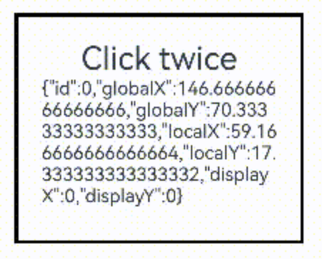
Text('Click twice').fontSize(28)
.gesture(
// 绑定count为2的TapGesture
TapGesture({ count: 2 })
  .onAction((event: GestureEvent|undefined) => {
  if(event){
    this.value = JSON.stringify(event.fingerList[0]);
  }
  }))
fingerList有这些信息:
LongPressGesture
@State count: number = 0;
build() {
  Text('LongPress OnAction:' + this.count).fontSize(28)
  .gesture(
    // 绑定可以重复触发的LongPressGesture
    LongPressGesture({ repeat: true })
      .onAction((event: GestureEvent|undefined) => {
        if(event){
          if (event.repeat) {
            this.count++;
          }
        }
      })
      .onActionEnd(() => {
        this.count = 0;
      })
  )
}
支持按住不动反复触发,onActionEnd()在松开时触发
PanGesture
滑动达到最小滑动距离(默认值为5vp)时滑动手势识别成功,参数定义
.gesture(
  PanGesture()
    .onActionStart(() => {
      console.info("Pan start");
    })
    .onActionUpdate((event: GestureEvent) => {
      // 单指上下滑动
      if (event.source === SourceType.TouchScreen) {
        console.info("finger move triggered PanGesture");
        this.handlePanUpdate(event);
      }
      if (event.source === SourceType.Mouse && event.sourceTool === SourceTool.MOUSE) {
        // 鼠标左键按住上下滑动或者触控板单指按住上下滑动
        if (event.axisHorizontal === 0 && event.axisVertical === 0) {
          console.info("mouse move with left button pressed triggered PanGesture");
          this.handlePanUpdate(event);
        } else { // 鼠标滚轮滚动
          console.info("mouse wheel triggered PanGesture");
          this.handleWheelEvent(event);
        }
      }
      if (event.sourceTool === SourceTool.TOUCHPAD && (event.axisHorizontal !== 0 || event.axisVertical !== 0)) {
        console.info("touchpad double finger move triggered PanGesture");
        this.handleTouchPadScroll(event);
      }
    })
)
上例完整示例中,touchpad的移动用了event.offsetY*0.02,别的都乘0.1,注意下差别
PinchGesture
.scale({ x: this.scaleValue, y: this.scaleValue, z: 1 })
.gesture(
  // 在组件上绑定三指触发的捏合手势
  PinchGesture({ fingers: 3 })
    .onActionStart((event: GestureEvent|undefined) => {
      console.info('Pinch start');
    })
      // 当捏合手势触发时,可以通过回调函数获取缩放比例,从而修改组件的缩放比例
    .onActionUpdate((event: GestureEvent|undefined) => {
      if(event){
        this.scaleValue = this.pinchValue * event.scale;
        this.pinchX = event.pinchCenterX;
        this.pinchY = event.pinchCenterY;
      }
    })
    .onActionEnd(() => {
      this.pinchValue = this.scaleValue;
      console.info('Pinch end');
    })
)
RotationGesture
.rotate({ angle: this.angle })
.gesture(
  RotationGesture()
    .onActionStart((event: GestureEvent|undefined) => {
      console.info('RotationGesture is onActionStart');
    })
      // 当旋转手势生效时,通过旋转手势的回调函数获取旋转角度,从而修改组件的旋转角度
    .onActionUpdate((event: GestureEvent|undefined) => {
      if(event){
        this.angle = this.rotateValue + event.angle;
      }
      console.info('RotationGesture is onActionUpdate');
    })
      // 当旋转结束抬手时,固定组件在旋转结束时的角度
    .onActionEnd(() => {
      this.rotateValue = this.angle;
      console.info('RotationGesture is onActionEnd');
    })
    .onActionCancel(() => {
      console.info('RotationGesture is onActionCancel');
    })
)
SwipeGesture
.rotate({ angle: this.rotateAngle })
.gesture(
  // 绑定快滑手势且限制仅在竖直方向滑动时触发
  SwipeGesture({ direction: SwipeDirection.Vertical })
    // 当快滑手势触发时,获取滑动的速度和角度,实现对组件的布局参数的修改
    .onAction((event: GestureEvent|undefined) => {
      if(event){
        this.speed = event.speed;
        this.rotateAngle = event.angle;
      }
    })
)
当SwipeGesture和PanGesture同时绑定时,SwipeGesture的触发条件为滑动速度达到100vp/s,PanGesture的触发条件为滑动距离达到5vp,先达到触发条件的手势触发。可以通过修改SwipeGesture和PanGesture的参数以达到不同的效果。
组合手势
支持顺序识别、并行识别和互斥识别三种类型。
// 顺序识别
// 长按之后拖动
.gesture(
  // 声明该组合手势的类型为Sequence类型
  GestureGroup(GestureMode.Sequence,
    // 该组合手势第一个触发的手势为长按手势,且长按手势可多次响应
    LongPressGesture({ repeat: true })
      // 当长按手势识别成功,增加Text组件上显示的count次数
      .onAction((event: GestureEvent|undefined) => {
        if(event){
          if (event.repeat) {
            this.count++;
          }
        }
        console.info('LongPress onAction');
      })
      .onActionEnd(() => {
        console.info('LongPress end');
      }),
    // 应该是触发了长按手势成功后(比如设定为3秒才生效),才触发拖动手势
    PanGesture()
      .onActionStart(() => {
        this.borderStyles = BorderStyle.Dashed;
        console.info('pan start');
      })
        // 当该手势被触发时,根据回调获得拖动的距离,修改该组件的位移距离从而实现组件的移动
      .onActionUpdate((event: GestureEvent|undefined) => {
        if(event){
          this.offsetX = (this.positionX + event.offsetX);
          this.offsetY = this.positionY + event.offsetY;
        }
        console.info('pan update');
      })
      .onActionEnd(() => {
        this.positionX = this.offsetX;
        this.positionY = this.offsetY;
        this.borderStyles = BorderStyle.Solid;
      })
  )
  .onCancel(() => {
    console.info("sequence gesture canceled")
  })
)

// 并行手势
// 比如单击算单击的双击算双击的,各自达到条件就触发
.gesture(
  GestureGroup(GestureMode.Parallel,
    TapGesture({ count: 1 })
      .onAction(() => {
        this.count1++;
      }),
    TapGesture({ count: 2 })
      .onAction(() => {
        this.count2++;
      })
  )
)
上例中, 如果Parallel改为Exclusive,则单击和双击互斥,只能触发一个,事实上,如果只是点击屏幕,那么单击永远会先达到,上例中,双击手势就永远触发不了。
用onGestureRecognizerJudgeBegin来判断(仲裁)手势的优先级,注意跟前面的onGestureJudgeBegin区分,一个是用在单手势,一个是用在多手势。
.onGestureRecognizerJudgeBegin((event: BaseGestureEvent, current: GestureRecognizer, others: Array<GestureRecognizer>)=>{
  if (current.getType() !== GestureControl.GestureType.PAN_GESTURE) {
    return GestureJudgeResult.CONTINUE;
  }
  if (this.isLongPress) {
    return GestureJudgeResult.CONTINUE;
  }
  return GestureJudgeResult.REJECT;
})
多层级手势
- 触摸事件(
onTouch事件)是所有手势组成的基础,有Down,Move,Up,Cancel四种。 - 对于一般的容器组件(例如:Column),父子组件之间onTouch事件能够同时触发。
同时触发的意思是如果加了事件回调,都能进入:
ComponentA() {
    ComponentB().onTouch(() => {})
    ComponentC().onTouch(() => {})
}.onTouch(() => {})
点击B,A的onTouch和B的onTouch都会触发,而C的onTouch不会触发。
responseRegion
指定可以响应手势的区域:
ComponentA() {
    ComponentB()
    .onTouch(() => {})
    .gesture(TapGesture({count: 1}))
    .responseRegion({Rect1, Rect2, Rect3})
}
.onTouch(() => {})
.gesture(TapGesture({count: 1}))
.responseRegion({Rect4})
hitTestBehavior
hitTest在iOS里是找能响应的View,所以是自顶向下的,从示例代码来看,鸿蒙里也差不多是这个意思,也是自顶向下的,然后通过配置block还是transparent来决定是否向下找。
ComponentA() {
    ComponentB()
    .onTouch(() => {})
    .gesture(TapGesture({count: 1}))

    ComponentC() {
        ComponentD()
        .onTouch(() => {})
        .gesture(TapGesture({count: 1}))
    }
    .onTouch(() => {})
    .gesture(TapGesture({count: 1}))
    .hitTestBehavior(HitTestMode.Block)
}
.onTouch(() => {})
.gesture(TapGesture({count: 1}))
这里,C上配置了block,那么D就接不到onTouch了,这样也没法响应TapGesture,也就拦截不了TapGesture了,结果就是onTouch和TapGesture都作用在了C上。
Stack({alignContent: Alignment.Center}) {
  Row()
    .onTouch(() => {console.log('touch BBB')})
    .gesture(TapGesture({count: 1}).onAction(()=>console.log("BBBBB")))
    .background(Color.Red)
    .width('80%')
    .height('80%')

  Row()
    .onTouch(() => {console.log('touch CCC')})
    .gesture(TapGesture({count: 1}).onAction(()=>console.log("CCCCC")))
    .hitTestBehavior(HitTestMode.Transparent)
    .background(Color.Yellow)
    .width('60%')
    .height('60%')
}
.onTouch(() => {console.log('touch AAA')})
.gesture(TapGesture({count: 1}).onAction(()=>console.log("AAAAA")))
.width('100%')
.height('100%')
- 堆叠的例子里, C挡住了B,但因为配置了transparent,B也能接到
onTouch - 但是C最先触发了tapGesture,不会继续传播
- 不管B和C怎么遮挡,在它们上面触摸,本质上都是在A(Stack)上触摸,所以一定能触发A的
onTouch,这要理解一下,容器组件和它的子元素还是有区别的
继续这个例子,如果想要Stack接不到onTouch怎么办?配置配置为BLOCK或BLOCK_HIERARCHY,阻止向下继续hit test。这样触摸了C就结束了。
再继续,如果要忽略对C的手势,配置None, 这样首先就是B接到手势了。(默认是Default)
优先级
ComponentA() {
    ComponentB()
    .gesture(TapGesture({count: 1}))
}
.priorityGesture(TapGesture({count: 1})) // 优先响应
.parallelGesture(TapGesture({count: 1})) // 并行响应
父组件将会响应到tapgesture
以下是传递事件到Overlay下的伪代码:
@Builder
function builderOverlay(params: Params) {
  // 关键是这句
    Component().hitTestBehavior(HitTestMode.Transparent)
}

aboutToAppear(): void {
    let componentContent = new ComponentContent(
        this.context, wrapBuilder<[Params]>(builderOverlay),
        new Params(uiContext, {x:0, y: 100})
    );
    this.overlayManager.addComponentContent(componentContent, 0);
}
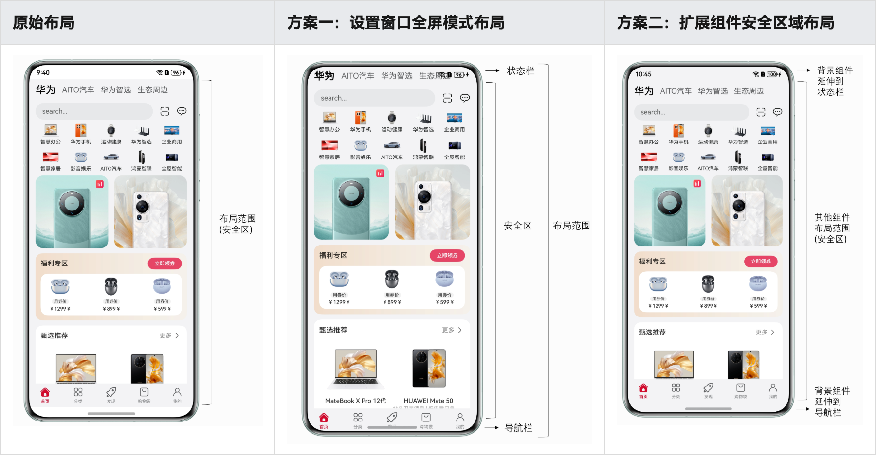
沉浸式
沉浸式页面开发常通过将应用页面延伸到状态栏和导航栏. 核心就是延伸,全屏和深色背景下的适配,以及挖孔区域适配
延伸方案:
- 使用Window.setWindowLayoutFullScreen()方法设置窗口为全屏模式。
- 设置组件的expandSafeArea属性,扩展组件的安全区域到状态栏和导航栏,从而实现沉浸式。
- 这个方案只延伸当前组件,不会改变整体页面的页面,更常用,因为一般就是把背景色延伸一下而已
安全区域就是正常呈现内容的区域,其它为避让区,比如底部的bar,顶部的导航条,各种刘海和挖孔,岛等
避让:
- 使用
Window.setWindowSystemBarEnable()方法- 或
Window.setSpecificSystemBarEnabled()方法设置状态栏和导航栏的显隐。
- 或
- 使用
Window.setWindowSystemBarProperties()方法设置状态栏和导航栏的样式。 - 使用
Window.getWindowAvoidArea()方法获取避让区域的高度,据此设置应用页面内容的上下padding实现避让状态栏和导航栏。 - 使用
Display.getCutoutInfo()方法获取挖孔区域宽高和位置信息,设置对应避让元素的margin实现挖孔区避让。
expandSafeArea
Tabs({ barPosition: BarPosition.End }) {
  // ...
}
.backgroundColor('#F1F3F5')
.expandSafeArea([SafeAreaType.SYSTEM], [SafeAreaEdge.TOP, SafeAreaEdge.BOTTOM])
Window.setWindowLayoutFullScreen要复杂些,通过Window.getWindowAvoidArea()方法获取状态栏和导航栏高度,并用状态变量avoidArea记录。使用avoidAreaChange事件监听避让区域的变化,变化时更新状态变量avoidArea。
context = this.getUIContext()?.getHostContext() as common.UIAbilityContext;
private windowClass = this.context.windowStage.getMainWindowSync();
@State avoidArea: AvoidArea = { topRectHeight: 0, bottomRectHeight: 0 };

onShown() {
  this.windowClass.setWindowLayoutFullScreen(true);
  this.setAvoidArea()
  this.windowClass.on('avoidAreaChange', this.onAvoidAreaChange)
}

// ...

setAvoidArea() {
  // status bar area
  const statusBarArea = this.windowClass.getWindowAvoidArea(statusBarType);
  this.avoidArea.topRectHeight = statusBarArea.topRect.height;
  // navigation bar area
  const navBarArea = this.windowClass.getWindowAvoidArea(navBarType);
  this.avoidArea.bottomRectHeight = navBarArea.bottomRect.height;
}

onAvoidAreaChange = (data: window.AvoidAreaOptions) => {
  if (data.type === statusBarType) {
    this.avoidArea.topRectHeight = data.area.topRect.height;
  } else if (data.type === navBarType) {
    this.avoidArea.bottomRectHeight = data.area.bottomRect.height;
  }
}

// Tabs

Tabs({ barPosition: BarPosition.End }) {
  // ...
}
.backgroundColor('#F1F3F5')
.padding({
  top: this.avoidArea.topRectHeight + 'px',
  bottom: this.avoidArea.bottomRectHeight + 'px'
})
图片滚动到状态栏下面,但是返回按钮,菜单图标等不需要滚动:
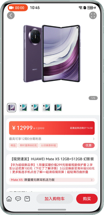 方案:
只对swiper里的图片做
方案:
只对swiper里的图片做expandSafeArea,对swiper不clip,使得图片可以滚动到swiper区别以外(不设置的话,图片会被状态栏挡住)
Swiper(this.swiperController) {
  ForEach(BANNER_IMAGES, (image: Resource) => {
    Image(image)
      .width('100%')
      .height('100%')
      .expandSafeArea([SafeAreaType.SYSTEM], [SafeAreaEdge.TOP])
  }, (image: Resource) => JSON.stringify(image))
}
.clip(false)
 让list expand到底部即可:
List() {
  // 列表
  ForEach(getFaqData(), (faq: Faq) => {
    ListItem() {
      this.FaqItem(faq)
    }
  }, (faq: Faq) => JSON.stringify(faq))
  // bottom
  ListItem() {
    Text($r('已加载全部'))
      .width('100%')
      .textAlign(TextAlign.Center)
      .opacity(0.6)
      .padding({ top: 10, bottom: 10 })
  }
}
.layoutWeight(1)
.scrollBar(BarState.Off)
.expandSafeArea([SafeAreaType.SYSTEM], [SafeAreaEdge.BOTTOM])
进入和退出全屏模式
// products/default/src/main/ets/pages/VideoPlayer.ets
context = this.getUIContext()?.getHostContext() as common.UIAbilityContext;
private windowClass = this.context.windowStage.getMainWindowSync();
// ...

onShown() {
  this.windowClass.setWindowLayoutFullScreen(true);
  this.windowClass.setWindowSystemBarEnable([]);
}

onHidden() {
  this.windowClass.setWindowLayoutFullScreen(false);
  this.windowClass.setWindowSystemBarEnable(['status', 'navigation']);
}

build() {
  NavDestination() {
    Column() {
      Video({ src: $rawfile('video.mp4') })
        // ...
    }
    .height('100%')
    .width('100%')
  }
  .hideTitleBar(true)
  .onShown(() => this.onShown())
  .onHidden(() => this.onHidden())
}
挖孔区避让
// 1. 设置全屏,打开沉浸模式
turnOnImmersive() {
  this.windowClass.setWindowLayoutFullScreen(true);
  this.windowClass.setWindowSystemBarEnable([]);
}

// 2. 通过Display.getCutoutInfo()方法获取挖孔区域的宽高和位置信息
async getCutoutInfo() {
  const displayClass = display.getDefaultDisplaySync();
  const res = await displayClass.getCutoutInfo();
  return res.boundingRects;
}

// 3. 计算目标元素的margin,保存变量, 然后更新目标元素的margin
async setStatusBarMargin(windowWidth: number) {
  const cutoutInfo = await this.getCutoutInfo();
  this.statusBarMargin = this.getStatusBarMargin(cutoutInfo, windowWidth);
}
getStatusBarMargin(cutoutInfo: display.Rect[], windowWidth: number): StatusBarMargin {
  if (!cutoutInfo || cutoutInfo.length === 0) {
    return { left: 0, right: 0 };
  }
  const cutoutRect = cutoutInfo[0];
  const cutoutLeftGap = cutoutRect.left;
  const cutoutWidth = cutoutRect.width;
  const cutoutRightGap = windowWidth - cutoutLeftGap - cutoutWidth;
  if (Math.abs(cutoutLeftGap - cutoutRightGap) <= 10) {
    return { left: 0, right: 0 };
  }
  if (cutoutLeftGap < cutoutRightGap) {
    return { left: cutoutLeftGap + cutoutWidth, right: 0 };
  }
  return { left: 0, right: cutoutRightGap + cutoutWidth };
}
...
Row() {
  Image($r('app.media.game_props'))
    .width(80)
    .margin({ left: this.statusBarMargin.left + 'px' })
  Blank()
  Image($r('app.media.game_pause'))
    .width(48)
    .margin({ right: this.statusBarMargin.right + 'px' })
}
深色背景延伸后,状态栏文字颜色变白:
onShown() {
  this.windowClass.setWindowSystemBarProperties({
    statusBarContentColor: '#FFFFFF'
  });
}

onHidden() {
  this.windowClass.setWindowSystemBarProperties({
    statusBarContentColor: '#000000'
  });
}

build() {
  NavDestination() {
    Column() {
      Image(this.getBackGroundImage())
        .expandSafeArea([SafeAreaType.SYSTEM], [SafeAreaEdge.TOP, SafeAreaEdge.BOTTOM])
        .objectFit(ImageFit.Fill)
    }
    .height('100%')
    .width('100%')
  }
  .hideTitleBar(true)
  .onShown(() => this.onShown())
  .onHidden(() => this.onHidden())
}
- 设置
expandSafeArea属性进行组件绘制扩展时,组件不能设置固定宽高尺寸。可尝试用百分比或padding改变组件宽高。 - 设置
expandSafeArea属性的组件需与安全区域边界重合。 - 当设置
expandSafeArea属性的组件的父组件是滚动类容器,需设置父组件的clip属性,不裁剪内部组件 Navigation组件和NavDestination组件默认扩展安全区域至状态栏和导航栏,相当于默认设置了expandSafeArea([SafeAreaType.SYSTEM], [SafeAreaEdge.TOP, SafeAreaEdge.BOTTOM])属性。Tabs组件默认扩展安全区域至导航栏,相当于默认设置了expandSafeArea([SafeAreaType.SYSTEM], [SafeAreaEdge.BOTTOM])属性。- 那之前例子特意写Tabs扩展到bottom,是为了啥?
参考
深色模式
- 系统组件会自动切换,内容适配主要依靠资源目录。当系统对应的设置项发生变化后(如深浅色模式等),应用会自动加载对应资源目录下的资源文件。(系统语言同理)
- 系统为深色模式预留了
dark目录,该目录在应用创建时默认不存在,在进行深色模式适配时,需要开发者在src/main/resources中手动创建出dark目录,将深色模式所需的资源放置到该目录下。对于浅色模式所需的资源,可以放入默认存在的src/main/resources/base目录下。 - 在进行资源定义时,需要在base目录与dark目录中定义同名的资源。
切换方法:
- 开发者使用
setColorMode()方法将ColorMode设置为COLOR_MODE_NOT_SET,就能跟随系统颜色模式 - 手动设置为
COLOR_MODE_DARK或COLOR_MODE_LIGHT
获取当前的深浅色(及响应了系统深浅色切换后)并动态设置状态栏字体颜色。
方案1, 直接做两套资源文件,使用$r引用。
方案2,使用AppStorage存储状态,在页面中监听状态变化,动态设置状态栏字体颜色。
// 1. ability中获取状态,保存到app storage,供页面使用
export default class EntryAbility extends UIAbility {
  onCreate(want: Want, launchParam: AbilityConstant.LaunchParam): void {
    AppStorage.setOrCreate<ConfigurationConstant.ColorMode>('currentColorMode', this.context.config.colorMode);
    hilog.info(0x0000, 'testTag', '%{public}s', 'Ability onCreate');
  }

  // ...

  onConfigurationUpdate(newConfig: Configuration): void {
    const currentColorMode: ConfigurationConstant.ColorMode | undefined = AppStorage.get('currentColorMode');
    if (currentColorMode !== newConfig.colorMode) {
      AppStorage.setOrCreate<ConfigurationConstant.ColorMode>('currentColorMode', newConfig.colorMode);
    }
  }
}

// UI
@Entry
@Component
struct Index {
  // ...
  @StorageProp('currentColorMode') @Watch('onCurrentColorModeChange') currentColorMode: ConfigurationConstant.ColorMode =
    ConfigurationConstant.ColorMode.COLOR_MODE_NOT_SET;
  private windowObj: window.Window | null = null;

  aboutToAppear(): void {
    window.getLastWindow(this.getUIContext().getHostContext(), (err: BusinessError, data) => {
      this.windowObj = data;
    })
  }

  onCurrentColorModeChange(): void {
    if (!this.windowObj) {
      return;
    }
    if (this.currentColorMode === ConfigurationConstant.ColorMode.COLOR_MODE_LIGHT) {
      this.windowObj?.setWindowSystemBarProperties({
        statusBarContentColor: '#000000'
      })
    } else if (this.currentColorMode === ConfigurationConstant.ColorMode.COLOR_MODE_DARK) {
      this.windowObj?.setWindowSystemBarProperties({
        statusBarContentColor: '#FFFFFF'
      })
    }
  }

  // ...

  build() {
    // ...
  }
}
ArkUI优化
渲染流程:
- 根据UI描述创建后端页面节点树
- 包含属性更新,布局测算,事件处理等
- 测算是确定宽高
- 布局是确定四个顶点(其实有左上角和宽高就能确定了)
- 根据节点树生成界面描述数据结构--渲染树
- 由
RenderNode组成 - 包含大小,位置等属性
- 渲染线程执行绘制工作
- 11.1mm左右必须完成绘制,否则丢帧
减小节点数,或简化布局计算(尽量给定组件宽高)都能加快渲染
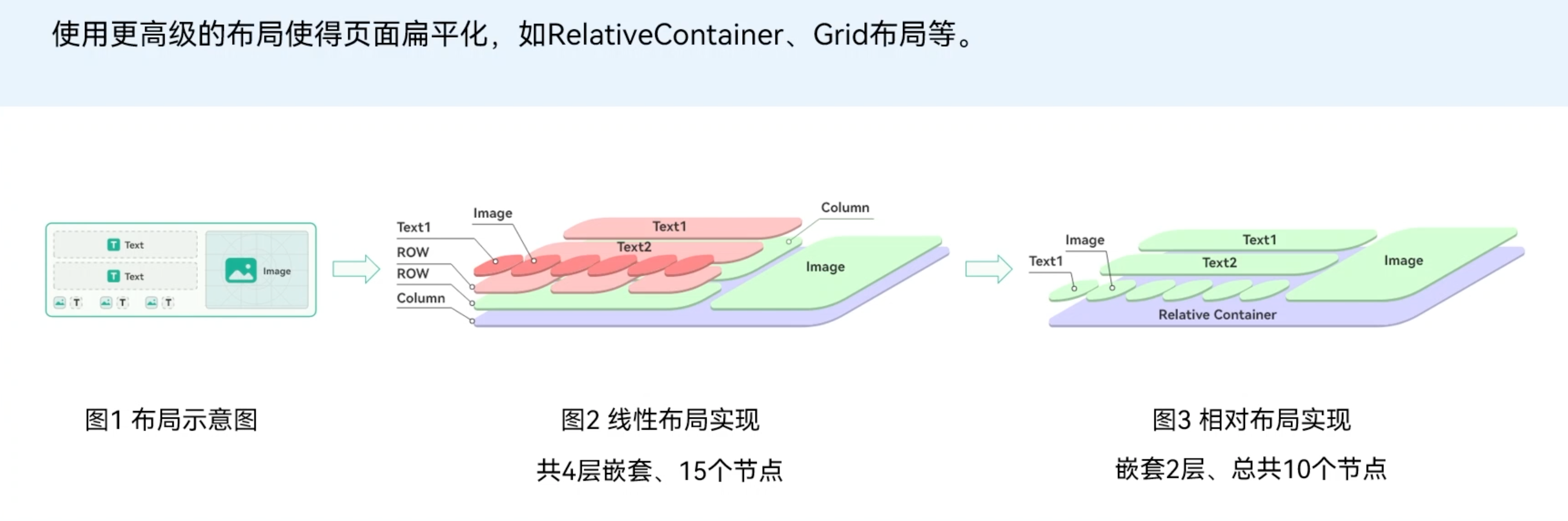 直接描述位置比用row, column一层层包裹确实更高效,横竖堆叠只是让逻辑更清楚,其实是让渲染变得更复杂,iOS的UIStackView也会存在这样的问题,直接
AutoLayout也会效率高些
使用if比visibility要重得多,因为切换的时候是在创建新的组件,重新进行了测算和布局,而visibility的组件一直挂在组件树上
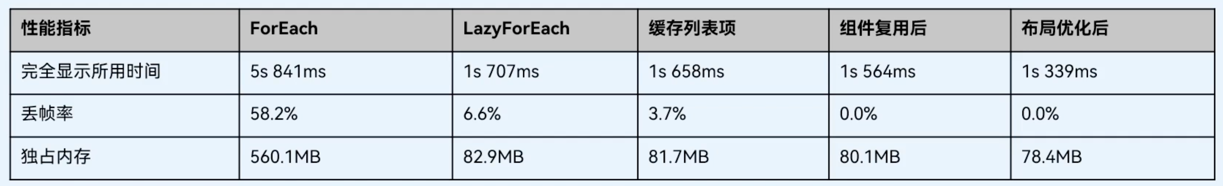
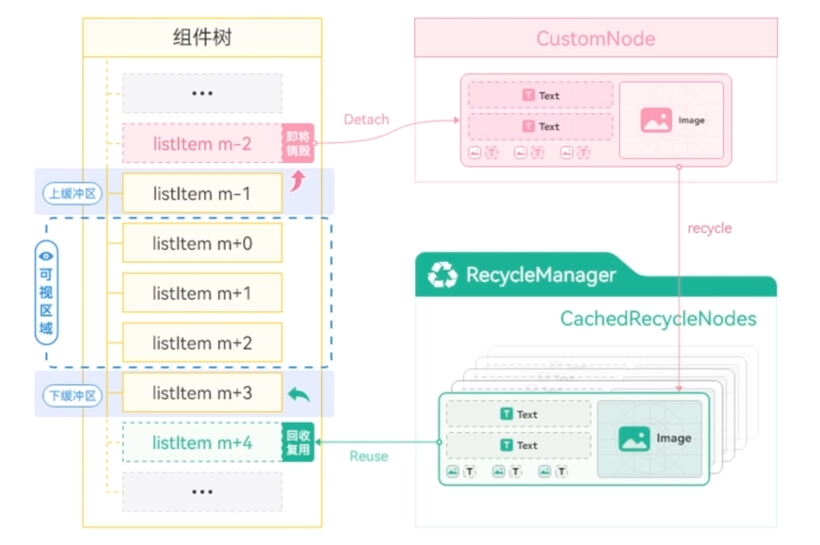 缓存列表项关键代码
@Component
Struct MyComponent {
  build () {
    list() {
      //…
      LazyForEach(…)
    }.cachedCount(n/2)
  }
}
组件复用关键代码
@Component
@Reusable // 1. 增加@Reusable注解
Export struct ArticleCardView {
  @Prop isCollected: boolean = false;
  @Prop isLiked: boolean = false;
  @Prop articleItem: LearningResource = new LearningResource();
  onCollected?: () => void;
  onLiked?: () => void;

  // 2. 增加刷新UI入口
  aboutToReuse(params) {
     this.onCollected = params.onCollected;
     this.onLiked = params.onLiked;
  }

  build() {
    ......
  }
}
@Component
export struct DiscoverView {
  private data: ArticleListData = new ArticleListData();
  ......
  build() {
    List() {
      Column() {
        LazyForEach(this.data, (item: LearningResource) => {
          ListItem() {
            Column() {
              ArticleCardView({
                articleItem: item
                ......
              })
            }
          }
          .reuseId(‘ArticleCardView') // 3. 增加复用ID
        }, (item: LearningResource) => item.id)
      }
    }.cachedCount(3);
  }
}
Web组件
参考Web组件
通讯录
import { contact } from '@kit.ContactsKit';
import { deviceInfo } from '@kit.BasicServicesKit';

chooseContact(): Promise<string> {
  let phone:string = '';
  let name:string = '';
  return new Promise((resolve) => {
    if (deviceInfo.productModel === 'emulator') {
      return resolve('13800000000_test');
    }
    let promise = contact.selectContacts(); // 就这么简单?!
    promise.then((info: Array<contact.Contact>) => {
      info.forEach((item: contact.Contact) => {
        phone = item?.phoneNumbers ? item?.phoneNumbers[0].phoneNumber : '';
        name = item?.name ? item?.name?.fullName : '';
      })
      resolve(phone + '_' + name);
    }).catch((err: object | string) => {
      hilog.error(0xFF00, 'SelectContact', '%{public}s', `selectContact fail: err->${JSON.stringify(err)}`);
    });
  })
}
通知
import { notificationManager } from '@kit.NotificationKit';
- 应用需要用户授权才能发送通知
文本通知
设置NOTIFICATION_CONTENT_BASIC_TEXT类型,过程也不简洁,要构造一个request再publish:
publishNotification() {
  let notificationRequest: notificationManager.NotificationRequest = { // 描述通知的请求
    id: 1, // 通知ID
    content: { // 通知内容
      notificationContentType: notificationManager.ContentType.NOTIFICATION_CONTENT_BASIC_TEXT, // 普通文本类型通知
      normal: { // 基本类型通知内容
        title: '通知内容标题',
        text: '通知内容详情'
      }
    }
  }
  notificationManager.publish(notificationRequest).then(() => { // 发布通知
    console.info('publish success');
  }).catch((err: Error) => {
    console.error(`publish failed,message is ${err}`);
  });
}
进度条通知
在发布进度类型通知前需要查询系统是否支持进度条模板。
notificationManager.isSupportTemplate('downloadTemplate').then(isSupport => {
  if (!isSupport) {
    this.getUIContext().getPromptAction().showToast({
      message: $r('app.string.invalid_button_toast')
    })
  }
  this.isSupport = isSupport;
});
然后再用downloadTemplate这个模板填充数据:
let template:notificationManager.NotificationTemplate = {
  name: 'downloadTemplate',
  data: {
    title:  `${title}`,
    fileName:  `${title}:${CommonConstants.DOWNLOAD_FILE}`,
    progressValue: progress,
    progressMaxValue: CommonConstants.PROGRESS_TOTAL,
    isProgressIndeterminate: false
  }
};
发布的代码,用template创建一个request再publish:
let notificationRequest: notificationManager.NotificationRequest = {
  id: CommonConstants.NOTIFICATION_ID,
  notificationSlotType: notificationManager.SlotType.CONTENT_INFORMATION,
  // Construct a progress bar template. The name field must be set to downloadTemplate.
  template: template,
  content: {
    notificationContentType: notificationManager.ContentType.NOTIFICATION_CONTENT_BASIC_TEXT,
    normal: {
      title: `${title}:${CommonConstants.DOWNLOAD_FILE}`,
      text: ' ',
      additionalText: `${progress}%`
    }
  },
  wantAgent: wantAgentObj
};
notificationManager.publish(notificationRequest).catch((err: Error) => {
  Logger.error(`[ANS] publish failed,message is ${err}`);
});
注意区分template里的data和request里的content, 一个用于绘制进度条,一个用于提供其它文本信息. 同时,相比于普通文本消息,也就多了一个template字段和notificationSlotType字段.
slotType好像是几种预设的类型,控制通知出现在哪些位置和提示音
- SlotType.
SOCIAL_COMMUNICATION:社交通信,状态栏中显示通知图标,有横幅,有提示音。 - SlotType.
SERVICE_INFORMATION:服务提醒,状态栏中显示通知图标,有横幅,有提示音。 - SlotType.
CONTENT_INFORMATION:内容资讯,状态栏中不显示通知图标,无横幅,无提示音。 - SlotType.
OTHER_TYPES:其它类型,状态栏中不显示通知图标,无横幅,无提示音。
更新通知
在发出通知后,使用您之前使用的相同通知ID,再次调用notificationManager.publish来实现通知的更新。如果之前的通知是关闭的,将会创建新通知。
移除通知
- 通过通知ID和通知标签取消已发布的通知
notificationManager.cancel(notificationId) - 取消所有已发布的通知
notificationManager.cancelAll()
通知组
let notifyId = 0;

let chatRequest: notificationManager.NotificationRequest = {
  id: notifyId++,
  groupName:'ChatGroup',
  content: {
    //...
   }
 };

let productRequest: notificationManager.NotificationRequest = {
  id: notifyId++,
  groupName: 'ProductGroup',
  content: {
    //...
   }
 };
同组通知可以折叠,比如聊天通知和商品推荐
行为意图
应用向Ability Kit申请WantAgent,并将WantAgent封装至通知中。当发布通知时,用户便可以通过点击通知栏中的消息或按钮,拉起目标应用组件或发布公共事件。
点通知几乎都是为了跳应用(鸿蒙叫拉起Ability),所以这一节省略掉的其实很重要
// NotificationUtil.ets
import { wantAgent } from '@kit.AbilityKit';
import { notificationManager } from '@kit.NotificationKit';
import CommonConstants from '../constants/CommonConstants';
import Logger from '../utils/Logger';
import { BusinessError } from '@kit.BasicServicesKit';

// Obtaining the Want Information of an App.
export function createWantAgent(bundleName: string, abilityName: string): Promise<object> {
  let wantAgentInfo = {
    wants: [
      {
        bundleName: bundleName,
        abilityName: abilityName
      }
    ],
    operationType: wantAgent.OperationType.START_ABILITY,
    requestCode: 0,
    wantAgentFlags: [wantAgent.WantAgentFlags.CONSTANT_FLAG]
  } as wantAgent.WantAgentInfo;
  return wantAgent.getWantAgent(wantAgentInfo);
}

// Publish a notification.
export function publishNotification(progress: number, title: string, wantAgentObj: object) {
  // Construct a notification template object.
  let template:notificationManager.NotificationTemplate = {
    name: 'downloadTemplate',
    data: {
      progressValue: progress,
      progressMaxValue: CommonConstants.PROGRESS_TOTAL,
      isProgressIndeterminate: false
    }
  };
  let notificationRequest: notificationManager.NotificationRequest = {
    id: CommonConstants.NOTIFICATION_ID,
    notificationSlotType: notificationManager.SlotType.CONTENT_INFORMATION,
    // Template object.
    template: template,
    content: {
      notificationContentType: notificationManager.ContentType.NOTIFICATION_CONTENT_BASIC_TEXT,
      normal: {
        title: `${title}:${CommonConstants.DOWNLOAD_FILE}`,
        text: ' ',
        additionalText: `${progress}%`
      }
    },
    // 有了这个就知道跳转了
    wantAgent: wantAgentObj
  };
  notificationManager.publish(notificationRequest).catch((err: BusinessError) => {
    Logger.error(`[ANS] publish failed, code is ${err.code}, message is ${err.message}`);
  });
}
使用
aboutToAppear() {
  openNotificationPermission(this.getUIContext().getHostContext() as common.UIAbilityContext);
  let bundleName = this.context.abilityInfo.bundleName;
  let abilityName = this.context.abilityInfo.name;
  createWantAgent(bundleName, abilityName).then(want => {
    this.wantAgentObj = want;
  }).catch((err: BusinessError) => {
    Logger.error(`getWantAgent fail, code is ${err.code}, message is ${err.message}`);
  });
}
// 发出通知
publishNotification(this.downloadProgress, this.notificationTitle, this.wantAgentObj);
Native/Node-Api
Node-API规范封装了I/O、CPU密集型、OS底层等能力并对外暴露C接口,使用C/C++模块的注册机制,向ArkTS/JS对象上挂载属性和方法的方式来实现ArkTS/JS和C/C++的交互。主要场景如下:
- 系统可以将框架层丰富的模块功能通过Node-API的模块注册机制对外暴露ArkTS/JS的接口,将C/C++的能力开放给应用的ArkTS/JS层。
- 应用开发者也可以选择将一些对性能、底层系统调用有要求的核心功能用C/C++封装实现,再通过ArkTS/JS接口使用,提高应用本身的执行效率。
ArkTS和C++之间的交互流程,主要分为以下两步:
- 初始化阶段:当ArkTS侧在
import一个Native模块时,ArkTS引擎会调用ModuleManager加载模块对应的so及其依赖。- 首次加载时会触发模块的注册,将模块定义的方法属性挂载到exports对象上并返回该对象。
- 调用阶段:当ArkTS侧通过上述import返回的对象调用方法时,ArkTS引擎会找到并调用对应的C/C++方法。
napi_env与ArkTS/JS线程的上下文环境绑定,每一个napi_env都持有独立的运行时上下文环境,当ArkTS/JS线程退出之后,相应的napi_env将不再有效。
三方库
添加本地库:
- File > New > Module (或工程根目录右键 > New > Module)
- 在Choose Your Ability Template界面中,选择Static Library
- 引用方式有以下几种:
ohpm install ../library --save- 或者编辑
entry/oh-package.json5,添加文件目录为依赖
- 使用:
import { Buttons } from '@ohos/library';
"dependencies": {
  "@ohos/library": "file:../library"
}